Red Purple Line Chart – Emphasizing Market Analysis and Performance
RJ0800048_13
- Last Update 08/13/2025
- File Size 2.5MB
- # of Slides 2
- File Format PPTX
- Slide Ratio 16:9
- Color
Keywords
- #Content-Based Slides
- #Design-Based Slides
- #Market and Competitor Analysis
- #Financial Plans and Performance
- #Graph
- #Market Analysis
- #Sales and Revenue
- #Line
- #Line Chart
- #16:9
- #line chart PowerPoint
- #dual-series chart template
- #trend analysis slide
- #market data visualization
- #performance comparison presentation
About the Product
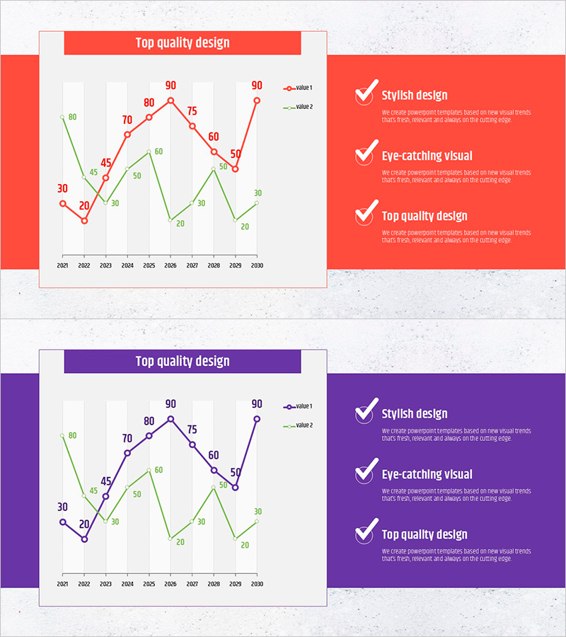
A PowerPoint slide set featuring a dual-series line chart for visualizing comparative data trends over time. The design uses red and purple color schemes to display 10 years of market data from 2001 to 2010, with clearly labeled data points and a legend for easy interpretation. Each slide includes numeric labels at every data point, enabling audiences to grasp precise values during presentations. Ideal for business presentations requiring time-series analysis such as revenue trends, market share comparisons, competitive performance benchmarking, and financial reporting. The slides are fully editable and ready for immediate use in pitch decks, investor presentations, and strategic planning documents.
Usage Points
-
Main Usage
Designed to compare and analyze the evolution of two or more data series over time. Effectively communicates time-series performance metrics such as revenue, profit margins, market share, and customer satisfaction to executives, investors, and team members through clear visual representation.
-
How to Use
Replace the existing data points and numeric labels with your actual data values for immediate deployment. Customize the legend position, axis labels, and colors to match your presentation theme. Adjust line thickness, background color, and fonts freely, or add additional data series as needed.
-
Recommended For
Finance professionals, marketing strategists, executives, management consultants, and sales leaders preparing quarterly or annual performance reports, market analyses, competitive benchmarking, and investor pitch decks. Particularly valuable for documents requiring simultaneous comparison of multiple metrics such as business plans, proposals, and strategic reports.
-
Slide Structure
2-slide set, each containing a dual-series line chart with red and purple lines representing 10 data points spanning 2001–2010. X-axis displays years, Y-axis shows numeric range (0–90), with gridlines, legend, and data labels included for clarity.
Related Products
-

Highlighted Line Charts and Tables – Market Analysis and Revenue Forecast
#Business Strategy #Market and Competitor Analysis #Diagram
-

Market Sales and Profit Analysis with Bar Chart – Analysis and Insights
#Market and Competitor Analysis #Financial Plans and Performance #Graph
-

Liquor Sales Line Chart – Visualizing Revenue and Profit
#Financial Plans and Performance #Graph #Projected Return on Investment (ROI)
-

Cost Increase Rate Analysis Chart
#Financial Plans and Performance #Diagram #Graph
