Brown Region Form Before and After Graphs – Data Comparison Visualization
RJ0800030_27
- Last Update 08/08/2025
- File Size 3.6MB
- # of Slides 2
- File Format PPTX
- Slide Ratio 16:9
- Color
Keywords
About the Product
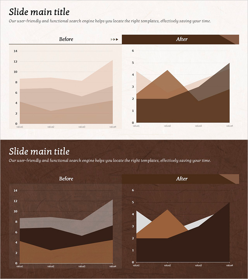
A PowerPoint area chart slide set featuring brown-toned stacked region graphs designed for before-and-after data comparison. This 2-slide template includes 4-series cumulative area charts on each slide, with color gradation from light beige to deep brown clearly distinguishing data layers. The horizontal axis displays 4 data points (value1 through value4), enabling intuitive visualization of trend changes across categories. Ideal for business presentations, performance reports, and analytical documents where quantitative shifts need clear visual communication.
Usage Points
-
Main Usage
Visualizes quantitative data changes over time or across stages using stacked area charts. Enables simultaneous representation of multiple data series for before-and-after comparisons, performance measurement, and trend analysis, allowing viewers to see both overall progression and individual series contributions.
-
How to Use
Double-click each chart to access Excel-based data editing. Replace value1–value4 labels and input corresponding numerical values for each series; the area chart updates automatically. Retain the brown color scheme while substituting only the data for immediate deployment.
-
Recommended For
Executive reports, business performance analysis, marketing campaign ROI measurement, financial status reviews, and project progress tracking. Recommended for professionals (executives, analysts, marketers, finance managers) requiring multi-layer data comparison in presentations.
-
Slide Structure
2-slide set. Each slide contains a title section and one 4-series stacked area chart. Charts feature a horizontal axis with 4 data points, vertical axis scaled 0–14, and 4 color-coded layers (light beige, tan, medium brown, dark brown) representing cumulative data series.
Related Products
-

Gender Ratio Analysis Graph Chart – Data Visualization and Customer Insights
#Market and Competitor Analysis #Graph #Other
-

Businessman Cartoon Theme Circle Graph – Market Analysis and Competitiveness
#Product/Service Introduction #Market and Competitor Analysis #Graph
-

Business Idea Development Analysis Circle Graph
#Business Introduction #Market and Competitor Analysis #Diagram
-

Office Supplies Theme Competitive Analysis Bar Graph
#Market and Competitor Analysis #Graph #Competitor Analysis
