Logistics Market Share Chart – Current Status and Competitive Analysis
RJ0800029_23
- Last Update 08/08/2025
- File Size 0.3MB
- # of Slides 2
- File Format PPTX
- Slide Ratio 16:9
- Color
Keywords
About the Product
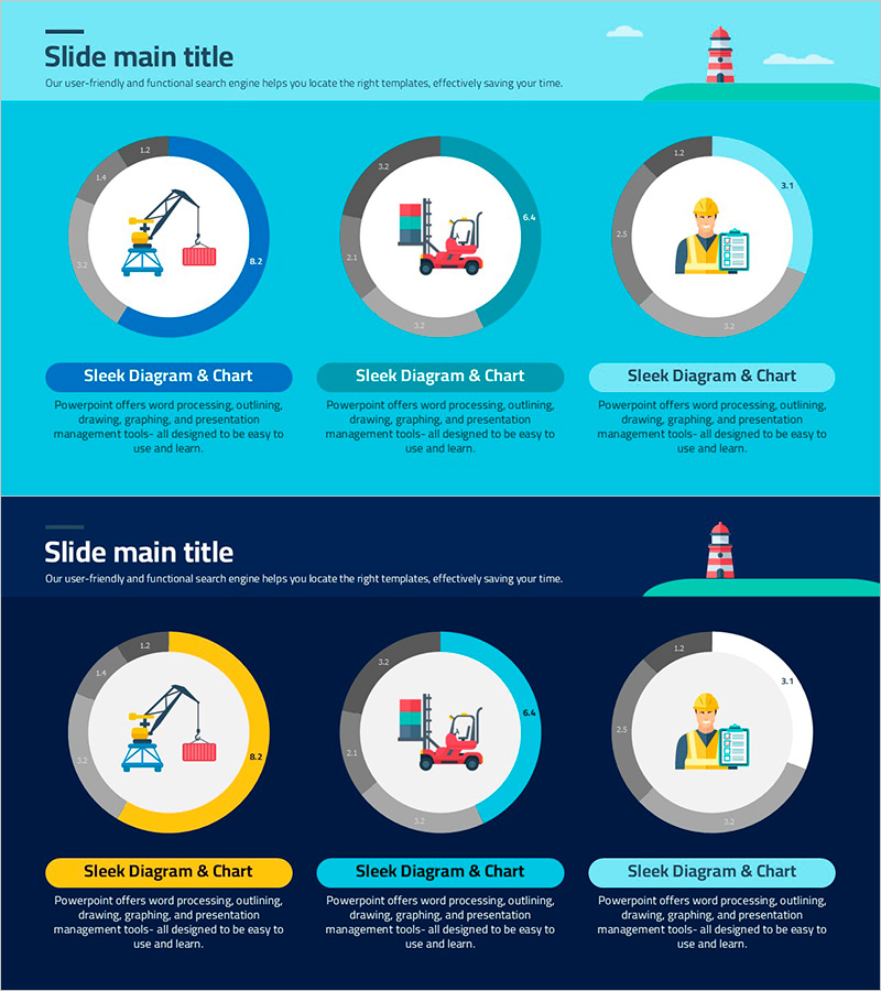
A donut chart PowerPoint slide designed to visualize logistics industry market share and competitive analysis. The slide features a light turquoise background with three donut-shaped pie charts arranged horizontally, each with a centered icon (crane, forklift, worker) symbolizing logistics processes. Provided in 2-slide format (16:9 aspect ratio), the layout includes a title section at the top and three donut chart areas with descriptive text boxes below each chart for market data input. The color scheme uses blue, turquoise, and light cyan tones with clear numerical labels and percentage indicators, making it ideal for presenting market share comparisons and industry trends.
Usage Points
-
Main Usage
Visualize logistics, transportation, and distribution industry market share, competitor comparison, and market status analysis using donut-shaped pie charts. The three-segment design enables simultaneous data representation for easy ratio comparison and trend identification, with centered icons emphasizing industry characteristics.
-
How to Use
Apply to business reports, market analysis documents, and investor presentation decks in the competitive landscape section. Modify percentage values and legends with actual market data, then input analysis content into text boxes for immediate use in presentations.
-
Recommended For
Ideal for logistics, transportation, and distribution company executives, marketing teams, and business development departments presenting market reports and strategic planning materials. Also suitable for consulting firms and research institutions preparing industry analysis reports.
-
Slide Structure
2-slide format (16:9 aspect ratio). Title section with lighthouse illustration at top, three horizontally arranged donut charts in center (blue, turquoise, light cyan color series), centered icons within each chart, descriptive text boxes below each chart. Numerical labels and percentage indicators clearly mark data input areas.
Related Products
-

Enrollment Stats & Ratios Donut Chart
#Market and Competitor Analysis #Graph #Market Status
-

Pie Chart for Decimal Ratio Analysis – Market Share Status
#Market and Competitor Analysis #Graph #Market Status
-

Market Share Analysis with Donut Chart – In-depth Understanding of Market and Competitors
#Market and Competitor Analysis #Graph #Market Status
-

Visualizing Fish Market Share with Doughnut Chart – Vitality of the Ocean
#Market and Competitor Analysis #Graph #Market Status
