Sleek Diagram and Bar Graph for Systematic Data Strategy
RJ0800028_21
- Last Update 08/07/2025
- File Size 2.7MB
- # of Slides 2
- File Format PPTX
- Slide Ratio 16:9
- Color
Keywords
- #Content-Based Slides
- #Design-Based Slides
- #Operational Plan
- #Diagram
- #Graph
- #Production and Technology Development Strategy
- #Capital Investment Plan
- #Cluster
- #Horizontal Bar
- #Closed Cluster Diagram
- #Segmented Horizontal Bar
- #16:9
- #horizontal bar chart PowerPoint
- #cluster diagram slide template
- #data comparison presentation
- #operational planning PPT
- #graph and diagram slide design
About the Product
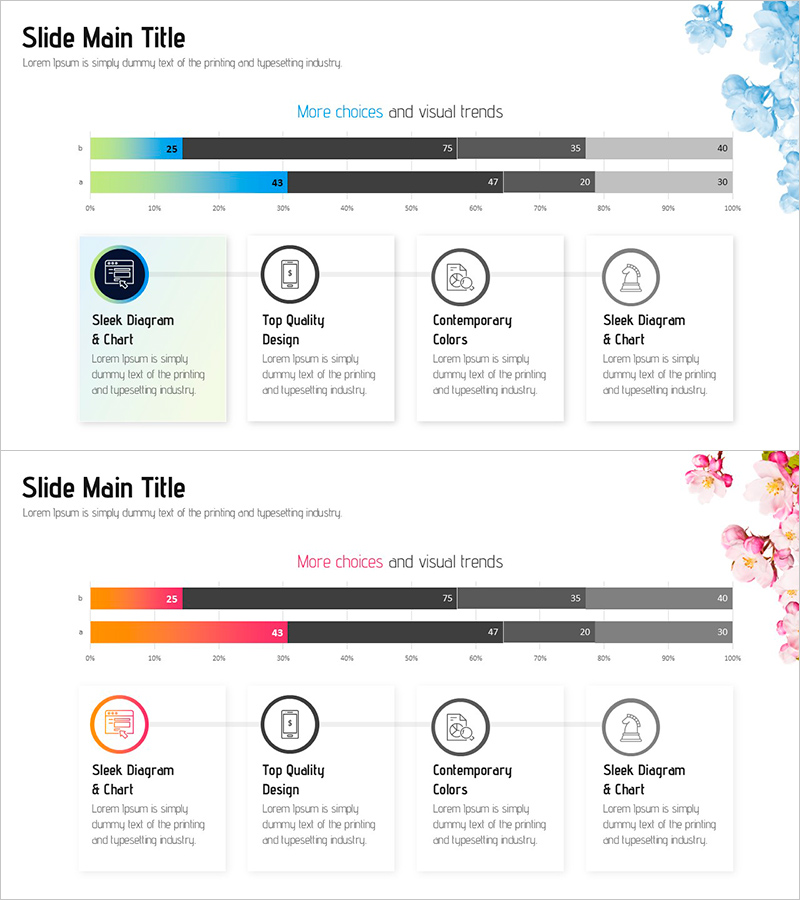
A 2-slide PowerPoint presentation set for visualizing data strategy and operational planning. The first slide features a gradient horizontal bar chart comparing four data points with numerical labels. The second slide displays a cluster diagram with four circular icons and accompanying text boxes arranged in a balanced layout. The design uses soft pastel blue, green, and orange tones complemented by floral decorative elements, creating a modern yet approachable aesthetic. Formatted in 16:9 widescreen PPTX, fully compatible with all presentation environments, with all elements fully editable for customization.
Usage Points
-
Main Usage
Designed to communicate both quantitative data and qualitative relationships in data-driven decision-making and operational planning contexts. The horizontal bar chart emphasizes numerical comparisons while the cluster diagram explains each item's role and interconnections.
-
How to Use
Replace bar lengths and numerical values with your actual data on the first slide. Customize the icons and text labels on the second slide to match your presentation topic. Maintain the color palette while adjusting to brand colors if needed. All elements are independently movable and resizable for flexible layout adjustments.
-
Recommended For
Ideal for data analysts, business strategists, operations managers, and marketing planners presenting quarterly reports, strategy meetings, and business planning sessions. Particularly effective when comparing four or more data points and explaining item-specific characteristics simultaneously.
-
Slide Structure
Slide 1: Four gradient horizontal bars (0-100% scale) with numerical labels and legend. Slide 2: Central title with four circular icon elements and corresponding text boxes arranged in symmetrical left-right layout. Floral decorative elements integrated throughout background.
Related Products
-

Performance Analysis Breakdown Bar Graph – Market and Competitor Analysis
#Company Introduction #Market and Competitor Analysis #Diagram
-

Food Truck Connection Diagram - Operations and Marketing Strategy
#Operational Plan #Marketing Plan and Strategy #Diagram
-

Introduction to Farming Harvest Business Program – Eco-friendly Future Market Outlook
#Product/Service Introduction #Operational Plan #Diagram
-

The Interior Structure of the Silver Town – Operational Planning and Facility Investment Strategy
#Operational Plan #Diagram #Production and Technology Development Strategy
