Rounding Horizontal Bar Graph to Visualize Performance – A Design that Aids Data Understanding
RJ0800024_8
- Last Update 08/06/2025
- File Size 1MB
- # of Slides 2
- File Format PPTX
- Slide Ratio 16:9
- Color
Keywords
About the Product
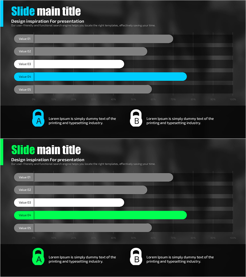
A PowerPoint slide featuring a horizontal bar chart comparing five data values with rounded bar ends for a smooth visual effect. Set against a dark background, cyan and lime accent colors clearly highlight data differences and performance metrics. Each bar scales from 0 to 100%, making it ideal for presenting achievement rates, performance comparisons, and proportional data. This presentation slide template is ready to use in reports, performance analyses, and business presentations.
Usage Points
-
Main Usage
Designed to compare five data values and display performance achievement rates at a glance. The rounded bar ends provide a smooth visual effect, while cyan and lime accent colors emphasize key data points. The 0–100% scale allows intuitive representation of ratios, achievement levels, and performance indicators.
-
How to Use
Use in business reports for performance analysis sections, marketing plans for goal achievement comparisons, investor pitch decks for results presentation, and quarterly or annual performance reports. Simply modify bar lengths and colors to input your actual data and apply it directly to your presentation.
-
Recommended For
Recommended for executives, team leaders, and project managers presenting performance metrics; sales and marketing teams comparing targets versus results; finance and planning departments presenting data-driven analysis. Suitable for any presentation requiring clear quantitative data communication.
-
Slide Structure
Two-slide set. First slide features a horizontal bar chart with five items and one cyan accent bar; second slide shows the same structure with one lime accent bar. Each slide includes two text boxes (A and B) at the bottom for additional explanations. 16:9 widescreen format, PPTX file.
Related Products
-

Holiday vs. Break Time Analysis Graph – Understanding Work Efficiency Through Statistics
#Product/Service Introduction #Market and Competitor Analysis #Graph
-

Donut Chart Slide for Furniture Preferences Survey
#Market and Competitor Analysis #Graph #Market Share
-

ABSTRACT PATTERN Presentation PIE CHART – Clearly Visualize Market Share
#Market and Competitor Analysis #Financial Plans and Performance #Diagram
-

Consumer Analysis Comparison Bar Graph – Data and Insights
#Market and Competitor Analysis #Graph #Competitive Advantage
