Graph Analysis of Daily Life – Insights Through Data Visualization
RJ0800024_26
- Last Update 08/06/2025
- File Size 1MB
- # of Slides 2
- File Format PPTX
- Slide Ratio 16:9
- Color
Keywords
About the Product
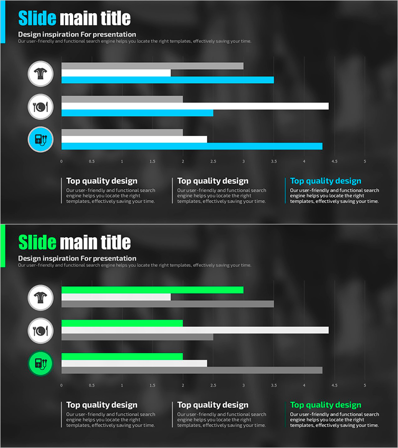
A horizontal bar chart PowerPoint slide for visualizing daily data analysis with clear numerical comparisons. Set against a dark background with cyan and lime green accent colors, this presentation slide displays three data categories with corresponding icons and horizontal axis scales. Each bar represents a distinct metric, making quantitative information intuitive and easy to interpret. Perfect for reports, business analysis, performance reviews, and statistical presentations that require effective data visualization.
Usage Points
-
Main Usage
Visualize and compare three data points or metrics using horizontal bars with icons and numerical scales. Ideal for presenting daily statistics, market analysis, performance indicators, or survey results. The horizontal layout makes it easy to compare values side-by-side and emphasize key figures in business reports and analytical presentations.
-
How to Use
Open the slide and replace the existing data values with your own numbers. Edit the icons and category labels to match your content. The dark background with cyan and lime green colors can remain as-is or be customized to match your brand palette. Use the horizontal bar lengths to guide audience attention during presentations.
-
Recommended For
Marketing professionals, business analysts, project managers, and executives presenting performance metrics, market share, budget allocation, customer satisfaction scores, or quarterly results. Suitable for business reports, strategy presentations, market research findings, and data-driven decision-making meetings.
-
Slide Structure
Two-slide set with identical layout structure. First slide features cyan accent bars for three data categories; second slide uses lime green accents. Each bar includes a circular icon on the left (shirt, fork, battery, etc.) and a horizontal axis scale (0-5) on the right for numerical representation.
Related Products
-

Doughnut Chart Visualized with Leather Material – Highlighting Competitive Edge
#Market and Competitor Analysis #Graph #Competitor Analysis
-

Market Competition and Analysis Graphs – Enhance Business Advantage
#Market and Competitor Analysis #Graph #Other
-

Origami Vision Donut Chart 2 – Market Analysis and Performance
#Market and Competitor Analysis #Financial Plans and Performance #Graph
-

User Analysis Graph by Age Group – Advanced Data Insights
#Market and Competitor Analysis #Diagram #Graph
