Three-Color Line Chart Slide – A New Horizon in Data Visualization
RJ0800023_8
- Last Update 08/06/2025
- File Size 1.1MB
- # of Slides 2
- File Format PPTX
- Slide Ratio 16:9
- Color
Keywords
About the Product
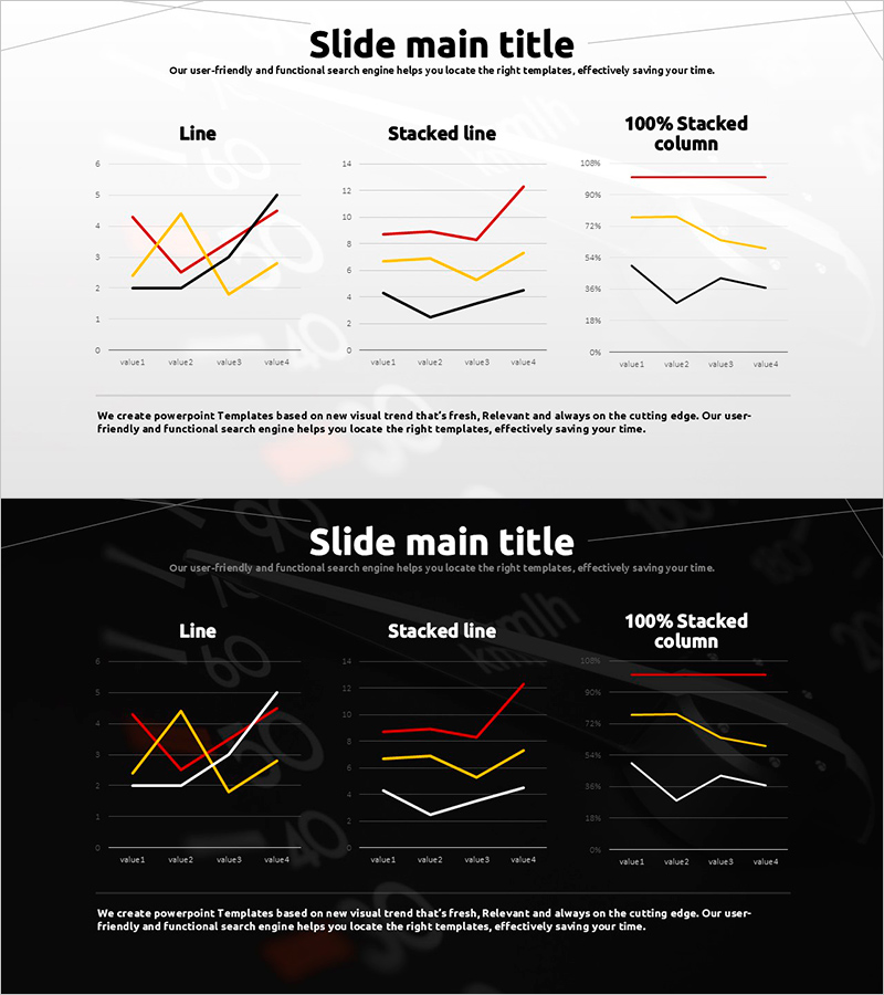
A PowerPoint slide featuring three-series line charts with red, yellow, and black lines representing different data sets. This presentation slide includes three chart variations on a single layout: standard line graph, stacked line chart, and 100% stacked column chart, allowing you to visualize the same data from multiple perspectives. Two design versions are provided—light background for printed materials and dark background for screen presentations. Each chart contains four data points (value1 through value4) and effectively communicates trend changes and numerical comparisons in business reports and performance analyses.
Usage Points
-
Main Usage
Ideal for comparing quarterly, monthly, or annual trends across three key metrics such as revenue, customer count, or website traffic. Enables executives and stakeholders to simultaneously analyze multiple performance indicators in financial reports, performance dashboards, and marketing presentations.
-
How to Use
Use the standard line graph to display basic trends, the stacked line chart to show total volume changes, and the 100% stacked column to emphasize composition ratio shifts. Edit data values in each chart to automatically update visualizations. Select the light background version for printed documents and the dark background for screen-based presentations.
-
Recommended For
Finance teams presenting quarterly earnings reports, marketing teams analyzing campaign performance, sales teams showcasing revenue trends, executives reviewing KPI dashboards, and researchers presenting time-series data. Particularly effective in management meetings requiring simultaneous comparison of multiple departmental metrics.
-
Slide Structure
Two-slide set. Slide 1 features three charts (line, stacked line, 100% stacked column) on a light background; Slide 2 displays identical charts on a dark background. Each chart includes four data points with editable labels, legend, axis titles, and chart headers for full customization.
Related Products
-

Business Competitor Analysis Comparison Graph – Market Status Insight
#Market and Competitor Analysis #Diagram #Graph
-

Graph of Industrial Change and Global Market Analysis – Understanding Market Trends
#Market and Competitor Analysis #Diagram #Graph
-

Identity Wide Template – Double Horizontal Bar Graph Usage
#Market and Competitor Analysis #Graph #Competitive Advantage
-

Visualizing Trends with Area Chart – Intuitive Analysis
#Graph
