Exercise Records Measurement Table – Market and Customer Analysis
RJ0800015_23
- Last Update 08/04/2025
- File Size 2.2MB
- # of Slides 2
- File Format PPTX
- Slide Ratio 16:9
- Color
Keywords
About the Product
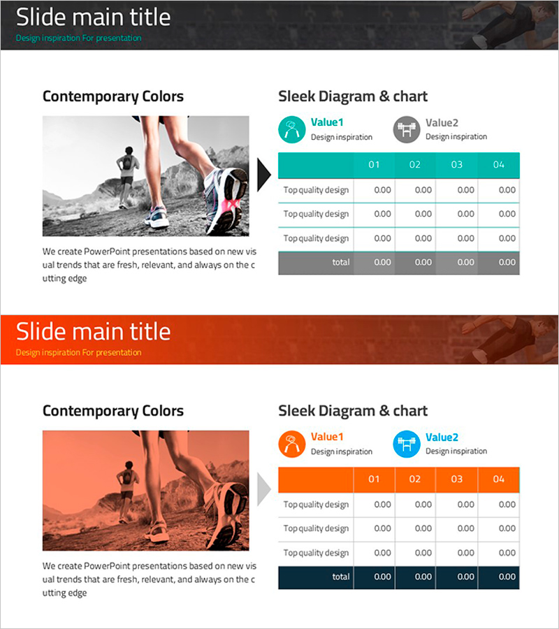
A data measurement and comparison PowerPoint slide designed for market and customer analysis presentations. The layout features a full-width image area on the left and a 2-row by 4-column data table on the right, enabling side-by-side visual storytelling. Two color versions—turquoise and orange—are provided to match different presentation themes. Each table cell accepts numeric values, percentages, and KPI metrics, with icon-labeled headers (Value1, Value2) for clear category distinction. Ideal for business reports, market analysis decks, and performance presentations requiring quantitative data visualization.
Usage Points
-
Main Usage
Visualize quantitative data in a structured table format to clearly communicate market trends, customer insights, and performance metrics. The parallel layout of image and numeric data enables simultaneous presentation of qualitative and quantitative information.
-
How to Use
Enter quarterly, monthly, or category-specific figures into each cell to display market share, customer satisfaction scores, revenue, growth rates, or other KPIs. Customize icon labels to reflect your analysis dimensions and select the color version matching your presentation theme or corporate branding.
-
Recommended For
Marketing strategy documents, business performance reports, investor presentations, quarterly earnings calls, market research summaries, and customer satisfaction surveys. Recommended for marketing managers, business analysts, sales leaders, and executives requiring data-driven decision support.
-
Slide Structure
Two-slide set, each featuring a full-width image area on the left (grayscale or color overlay) paired with a 2-row 4-column table on the right. Table headers use turquoise or orange accent colors; data rows alternate between gray and white backgrounds for optimal readability.
Related Products
-

Contact Customer Checklist Slide – Customer Analysis and Market Understanding
#Product/Service Introduction #Business Management #Market and Competitor Analysis
-

Child’s Travel Observation Log – Introduced with Friendly Diagrams
#Product/Service Introduction #Market and Competitor Analysis #Diagram
-

Medical Examination Record for Customer and Market Analysis – Effective Data Visualization
#Market and Competitor Analysis #Diagram #Customer Analysis
-

Trends in Youth Reading in Autumn
#Market and Competitor Analysis #Diagram #Market Status
