Performance Analysis Line Graph – Insights from Data
RJ0800015_21
- Last Update 08/04/2025
- File Size 0.8MB
- # of Slides 2
- File Format PPTX
- Slide Ratio 16:9
- Color
Keywords
About the Product
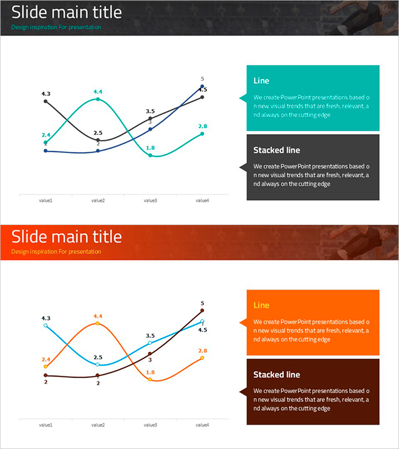
A professional multi-series line chart PowerPoint slide designed for performance analysis and comparative trend visualization. The slide features two distinct data series in teal and black, intersecting at multiple points to highlight diverging or converging trends. Each data point is labeled with numerical values for precise comparison, while the right-side text box provides space for chart interpretation and key insights. Delivered in 16:9 widescreen format with 2 slides, this template is ready for immediate use in quarterly business reports, sales performance presentations, and market analysis decks.
Usage Points
-
Main Usage
Visualize and compare two or more data series over time, such as quarterly revenue trends, monthly sales performance, customer satisfaction scores, or competitive benchmarking. The intersecting lines make it easy to identify correlation patterns, divergence points, and performance gaps between datasets.
-
How to Use
Replace the sample data in the chart area with your actual figures; the line series will automatically update. Use the right-side text box to add analysis commentary, key findings, or strategic recommendations. Customize colors and fonts to match your corporate branding guidelines for a cohesive presentation.
-
Recommended For
Finance teams presenting quarterly earnings reports, marketing teams analyzing campaign performance metrics, sales teams comparing regional or product-line results, and executives reviewing KPI dashboards. Ideal for situations requiring side-by-side comparison of two departments, product lines, or time periods.
-
Slide Structure
2-slide set. Slide 1: Teal header banner with dual-series line chart (4 data points with value labels) and teal text box on the right. Slide 2: Orange header banner with identical chart structure (orange and black series) and orange text box, providing color variation for different sections or emphasis.
Related Products
-

Market Share Analysis Donut Chart – Competitive Edge in the Market
#Product/Service Introduction #Market and Competitor Analysis #Graph
-

Changes in the Region Graph – Business Strategy and Outcomes
#Business Strategy #Graph #Other
-

Maximize Learning Effect with Creative Infographics
#Product/Service Introduction #Graph #Other
-

User Analysis Graph by Age Group – Advanced Data Insights
#Market and Competitor Analysis #Diagram #Graph
