Basic Donut Chart and Checklist – Effective Presentation Through Visual Data
RJ0800013_29
- Last Update 08/03/2025
- File Size 0.5MB
- # of Slides 2
- File Format PPTX
- Slide Ratio 16:9
- Color
Keywords
About the Product
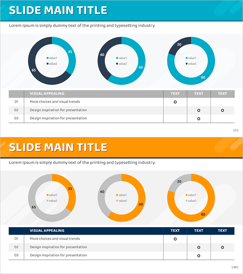
A professional PowerPoint slide featuring two donut charts designed to compare data ratios side by side. The dual-tone color scheme of blue and gray provides visual distinction while maintaining cohesive design aesthetics. Each donut chart displays two data series with embedded legends in the center, enabling clear information hierarchy without additional text boxes. The accompanying checklist section allows you to track key items and progress status, making this slide ideal for financial reports, market analysis, budget allocation presentations, and project status updates. Formatted in 16:9 widescreen ratio for seamless compatibility with modern projectors and displays.
Usage Points
-
Main Usage
Enables simultaneous comparison of two data series through visual donut chart representation. The center space of each donut accommodates legends, creating a self-contained visualization that requires minimal additional explanation. When combined with the checklist section, you can present analytical findings and action plans in an integrated format.
-
How to Use
Insert your ratio data into the two donut charts on the first slide—such as market share, budget distribution, or customer demographics. Use the second slide's checklist to document key action items, success criteria, and completion status. All chart colors, values, and text are fully editable through PowerPoint's native tools, allowing customization to match your brand guidelines.
-
Recommended For
Ideal for finance professionals, marketing strategists, and project managers presenting data-driven insights. Suitable for quarterly performance reviews, investment proposals, organizational restructuring announcements, and any business presentation requiring ratio-based comparison and progress documentation.
-
Slide Structure
Slide 1: Two donut charts in blue and gray tones, each displaying 2 data series with centered legends. Slide 2: Gray header bar with 3-row checklist table containing item name and visual status indicators across 3 columns. Light gray background throughout ensures optimal readability of charts and text elements.
Related Products
-

Competitor Comparison Broken Line Graph – Essential Tool for Market Analysis
#Market and Competitor Analysis #Graph #Competitor Analysis
-

City Theme Radial Graph Slide – Market and Competitor Analysis
#Business Introduction #Market and Competitor Analysis #Graph
-

Successful Teamwork Analysis Graph
#Technical Approach #Market and Competitor Analysis #Graph
-

Yellow Pink Comparison Chart – Competitive Advantage Analysis
#Market and Competitor Analysis #Graph #Competitor Analysis
