Green Orange Highlight Donut Chart
RJ0800008_6
- Last Update 08/02/2025
- File Size 0.6MB
- # of Slides 2
- File Format PPTX
- Slide Ratio 16:9
- Color
Keywords
About the Product
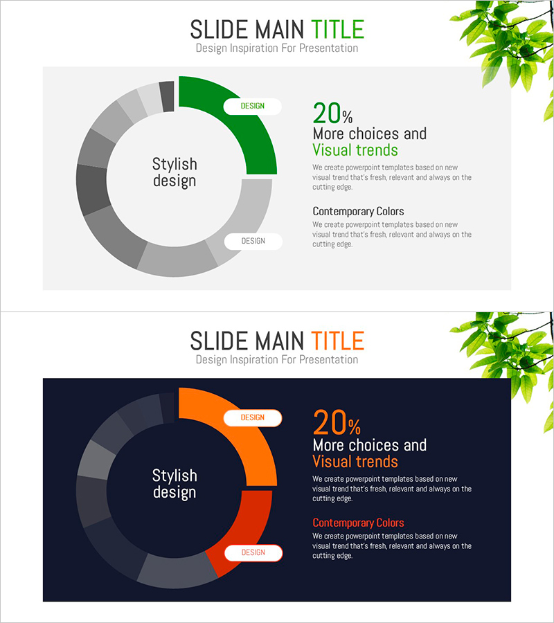
A donut chart PowerPoint slide that emphasizes data ratios using green and orange dual tones. The structure places key metrics in the central circular space with surrounding segments visualizing composition percentages, making it ideal for financial status, market share, and project progress analysis. The light gray background and clear color contrast enable immediate use in presentations, reports, and dashboards. The 2-slide set accommodates various data scenarios and comparison scenarios.
Usage Points
-
Main Usage
Visualize comparative analysis data such as financial status, market share, project progress, customer composition, and product sales ratios using a circular graph format with central metric emphasis for executive-level presentations and strategic decision-making.
-
How to Use
Slide 1 features light gray background with green accent; Slide 2 uses dark navy background with orange accent. Edit each segment's color and label to input actual data, then add key metrics or percentages in the central text area. All elements are fully editable in PowerPoint.
-
Recommended For
Executive reports, quarterly performance presentations, marketing analysis, financial briefings, client proposals, project status updates, and business presentations requiring data-driven decision support and stakeholder communication.
-
Slide Structure
2-slide set. Each slide contains a donut structure with 4-6 segments surrounding a central circular space for metric display, with legend and supplementary text area positioned on the right to provide data context and interpretation.
Related Products
-

High Quality Gradient Bar Graph – Market and Competitor Analysis
#Market and Competitor Analysis #Graph #Market Analysis
-

Chemical Experiment Vertical Bar Graph - Data Visualization and Analysis
#Market and Competitor Analysis #Graph #Competitor Analysis
-

Trend Color Wide Template Bar Chart
#Product/Service Introduction #Graph #Development Status
-

Artificial Intelligence Donut Chart Analysis – A New Standard in Data Visualization
#Technical Approach #Graph #Other
