Yellow Pink Growth Comparison Graph
RJ0800004_19
- Last Update 07/31/2025
- File Size 1.2MB
- # of Slides 2
- File Format PPTX
- Slide Ratio 16:9
- Color
Keywords
About the Product
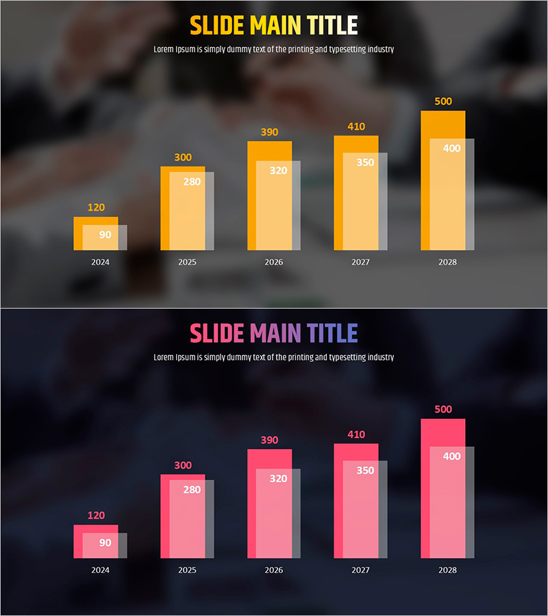
A PowerPoint bar chart slide comparing growth trends from 2024 to 2028 across five years. The dual-tone color scheme of yellow and pink clearly distinguishes two data series, with numerical values displayed intuitively for each year. Ready to use in presentations with background imagery, this slide is ideal for comparing various growth metrics such as revenue, visitors, or user registrations. The 2-slide set includes design variations so you can choose the best option for your presentation context.
Usage Points
-
Main Usage
Visualize year-over-year performance metrics across two data series. Clearly communicate growth stories by displaying annual trends in revenue, visitor counts, user registrations, or transaction volumes.
-
How to Use
Use in business reports, earnings presentations, and investor pitch decks to compare annual growth rates. Assign yellow to primary metrics and pink to comparative metrics, or contrast performance between departments and product lines.
-
Recommended For
Ideal for executives, finance teams, marketing departments, and sales teams presenting quarterly and annual performance results. Recommended for startup investor presentations, corporate earnings disclosures, and departmental performance reviews.
-
Slide Structure
5-year bar chart (2024–2028) with 2 data series. Yellow and pink bars are positioned side-by-side for each year, with numerical labels displayed above. The 2-slide set offers background image variations for flexible design options.
Related Products
-

(Orange & Green) Bundle Chart and Future Outlook
#Business Strategy #Financial Plans and Performance #Graph
-

Nutrient Intake Distribution Pie Chart – Analysis of Dietary Composition
#Product/Service Introduction #Market and Competitor Analysis #Graph
-

Equipment Demand Configuration Graph – Effective Visualization for Market Analysis
#Market and Competitor Analysis #Diagram #Graph
-

Core Technologies of AI Chipsets: Performance Characteristics
#Market and Competitor Analysis #Diagram #Graph
