Yellow Point Stacked Chart – The Essence of Data Visualization
RJ0800003_29
- Last Update 07/31/2025
- File Size 0.5MB
- # of Slides 2
- File Format PPTX
- Slide Ratio 16:9
- Color
Keywords
About the Product
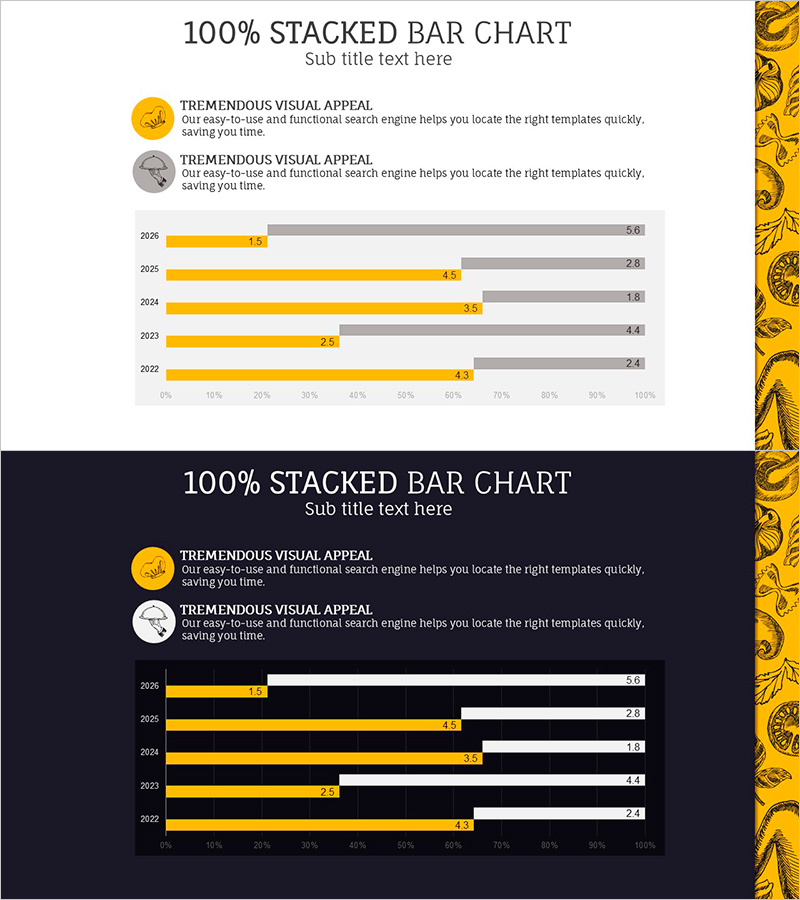
A PowerPoint slide template featuring a 100% stacked bar chart that visualizes two data series side by side. The design includes two versions with light and dark backgrounds, using yellow and gray color schemes to distinguish between the two data categories. The chart displays five years of trend data (2022–2026) with value labels on each bar segment for clear ratio comparison. This presentation slide is ready to use in business reports, performance analyses, and data-driven presentations.
Usage Points
-
Main Usage
Compare the proportional changes of two data categories across multiple time periods or categories. Ideal for visualizing marketing performance, sales composition, customer distribution, budget allocation, and other ratio-based metrics in a single, easy-to-read format.
-
How to Use
Replace the sample data in the stacked bar chart with your own values. The chart automatically recalculates percentages and updates the visualization. Customize the yellow and gray colors to match your corporate branding, and select either the light or dark background version depending on your presentation environment.
-
Recommended For
Executive reports, quarterly performance presentations, marketing analysis decks, financial status updates, customer segmentation analysis, and market share comparisons. Recommended for business analysts, marketing professionals, financial planners, and project managers.
-
Slide Structure
Two-slide set: Slide 1 features a 100% stacked bar chart on a light background with yellow and gray series, displaying five years of data (2022–2026) with labeled values. Slide 2 is identical in structure but with a dark background. 16:9 widescreen format, fully editable PPTX file.
Related Products
-

Visualizing Sales Performance with Structural Photos and Graphs
#Financial Plans and Performance #Graph #Sales and Revenue
-

Eco-friendly Donut Graph Analysis – Insights on Market Trends
#Market and Competitor Analysis #Graph #Market Status
-

3 Radial Charts and Analysis – Competitor and Market Trends
#Market and Competitor Analysis #Diagram #Graph
-

Simple Circle Template Column Chart – Market Analysis and Strategy
#Market and Competitor Analysis #Graph #Competitive Advantage
