Colorful Bundled Chart – Visual Trends
RJ0800001_7
- Last Update 07/31/2025
- File Size 0.5MB
- # of Slides 2
- File Format PPTX
- Slide Ratio 16:9
- Color
Keywords
About the Product
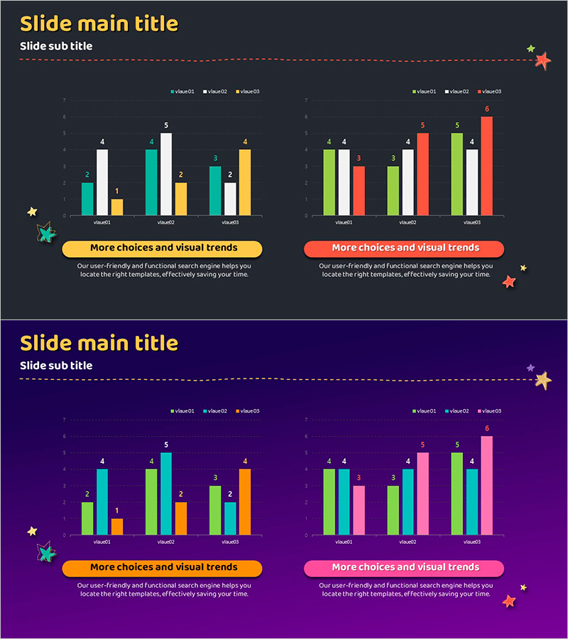
A professional PowerPoint slide featuring grouped bar charts that compare 6 data series across 3 categories. The dark background with green, white, orange, red, and yellow bars creates clear visual distinction for each data set. This 2-slide template includes identical layouts with dedicated text areas and CTA buttons to highlight key insights. Perfect for business presentations, quarterly performance reports, market analysis comparisons, and competitive benchmarking. All chart values and colors are fully editable for your specific data needs.
Usage Points
-
Main Usage
Designed to compare multiple data points simultaneously while emphasizing differences across series. Ideal for displaying quarterly revenue, departmental performance, competitor analysis, market share distribution, and other multi-dimensional datasets at a glance.
-
How to Use
Bar height and color represent data values, with grouped arrangement clarifying comparison structure. Add key insights in the text area and use CTA buttons to guide audience action. All colors, values, and labels are fully customizable to match your data and branding.
-
Recommended For
Finance, sales, and marketing professionals presenting quarterly results; executive dashboards; market research findings; departmental performance reviews; investor pitch decks. Suitable for any data-driven business presentation requiring multi-series comparison.
-
Slide Structure
2-slide template. Each slide contains grouped bar charts with 3 categories (value01, value02, value03) and 6 data series (green, white, orange, red, yellow, additional color). Text description area and yellow/red CTA buttons positioned to the right of each chart.
Related Products
-

Artificial Intelligence Donut Chart Analysis – A New Standard in Data Visualization
#Technical Approach #Graph #Other
-

Curved Theme Purple Pie Chart for Business Strategy and Vision Presentation
#Company Introduction #Business Vision and Strategy #Diagram
-

User Analysis Graph by Age Group – Advanced Data Insights
#Market and Competitor Analysis #Diagram #Graph
-

Pie Chart and Chopa Illustration – Market Analysis Slide
#Market and Competitor Analysis #Financial Plans and Performance #Graph
