Data Analysis Donut Circle Graph – The Start of Effective Visualization
RJ0700028_6
- Last Update 07/30/2025
- File Size 0.9MB
- # of Slides 2
- File Format PPTX
- Slide Ratio 16:9
- Color
Keywords
- #Content-Based Slides
- #Design-Based Slides
- #Product/Service Introduction
- #Technical Approach
- #Diagram
- #Graph
- #Composition
- #Service Development Plan
- #Cluster
- #Circles
- #Chain Diagram
- #Doughnut Chart
- #16:9
- #donut chart PowerPoint slide
- #pie chart template download
- #data ratio visualization PPT
- #circular graph presentation
- #business data visualization slide
About the Product
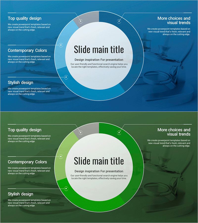
A professional donut circle graph PowerPoint slide template optimized for data analysis and business reporting. This 2-slide deck features blue and green color schemes designed for 16:9 widescreen format, with a central circular space for key metrics or titles. Each slide combines a left text area for descriptions and a right donut chart area for visual data representation. The PPTX format allows you to freely edit colors, values, and text for immediate use in presentations, financial reports, market analysis, and strategic planning documents.
Usage Points
-
Main Usage
Visualize data composition ratios with an intuitive donut circle graph design. The central circular space displays key metrics or percentages, clearly showing the relationship between parts and the whole. Ideal for revenue breakdown, market share, budget allocation, customer distribution, and comparative analysis.
-
How to Use
Enter data labels and descriptions in the left text area, then edit the donut chart sections with colors and values on the right. Place summary metrics or key messages in the central circle to enhance emphasis. Use the blue slide for technical or financial sections and the green slide for growth or environmental topics to maintain document consistency.
-
Recommended For
Financial reports, business analysis presentations, marketing performance reviews, market research findings, organizational structure explanations, and customer segmentation analysis. Suitable for executive briefings, investor presentations, internal meetings, and academic presentations requiring data-driven decision-making.
-
Slide Structure
2-slide layout with left text area (3 items) and right donut chart (3-4 sections per slide). Central circle space for summary metrics or emphasis text. Blue and green color series options. Optimized for 16:9 widescreen display. Fully customizable data values and labels.
Related Products
-

The Proportion and Characteristics of Composed Flowers – Engaging Infographic Slide
#Product/Service Introduction #Market and Competitor Analysis #Diagram
-

Cluster Diagram Slide for Service Operation Plan
#Technical Approach #Diagram #Service Development Plan
-

Introduction to Business Services – System and Service Diagram
#Business Management #Technical Approach #Diagram
-

Rocket Research Progress Pie Chart – Market and Service Analysis
#Product/Service Introduction #Market and Competitor Analysis #Graph
