War Deaths Analysis Graph
RL0100062_3
- Last Update 01/21/2025
- File Size 2.7MB
- # of Slides 2
- File Format PPTX
- Slide Ratio 4:3
- Color
Keywords
About the Product
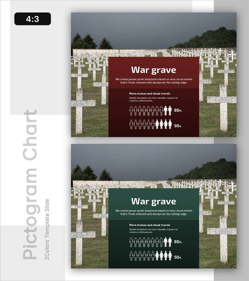
A PowerPoint slide that visualizes war-related death statistics by gender ratio using a burgundy background with white typography and icon-based infographics. Provided in 2 color variations (burgundy and dark green), each slide includes a title, descriptive text, gender population icons, and percentage figures. This presentation slide effectively communicates complex statistical data in an intuitive manner, making it ideal for reports, analytical presentations, and policy documents where sensitive topics require objective representation.
Usage Points
-
Main Usage
This slide presents sensitive statistical data (war casualties, loss of life) in an objective and visually clear manner. By comparing gender ratios, it clarifies data composition and supports credible information delivery in reports, academic presentations, and policy analysis materials.
-
How to Use
Edit the slide title, descriptive text, and percentage figures with your own data. Choose between the burgundy or dark green background to match your presentation tone, then adjust the number of icons and percentages to reflect actual statistics. Suitable for policy reports, academic conference presentations, and international meeting materials.
-
Recommended For
Policy analysts, researchers, academic presenters, international organization staff, media professionals, and educators who need to present statistical analysis on sensitive topics. This slide ensures both credibility and readability when explaining objective data.
-
Slide Structure
Each slide features a title at the top (War grave), descriptive text in the middle (2 lines), and gender-based icon infographics at the bottom (approximately 10 icons with percentage figures). Both slides share identical layouts with only background color variations (burgundy and dark green), providing visual diversity within documents.
Related Products
-

Sailing Travel Project Expected Return on Investment Design Chart
#Product/Service Introduction #Financial Plans and Performance #Graph
-

Europe and New York Map Market Share Table
#Market and Competitor Analysis #Diagram #Other
-

Brief Survey of the Region Slide – Effective Data Visualization
#Company Introduction #Other #Domestic Network
-

Blue Green Target Area Analysis – Optimized Template for Market and Competition Analysis
#Market and Competitor Analysis #Other #Target Market
