Donut Slide Visualizing COVID-19 Virus Types
RJ0700023_4
- Last Update 07/28/2025
- File Size 0.8MB
- # of Slides 2
- File Format PPTX
- Slide Ratio 16:9
- Color
Keywords
- #Content-Based Slides
- #Design-Based Slides
- #Product/Service Introduction
- #Market and Competitor Analysis
- #Graph
- #Composition
- #Market Analysis
- #Circles
- #Doughnut Chart
- #16:9
- #donut chart PowerPoint
- #pie chart slide template
- #4-segment ratio visualization
- #donut graph PPT slide
- #data visualization PowerPoint template
About the Product
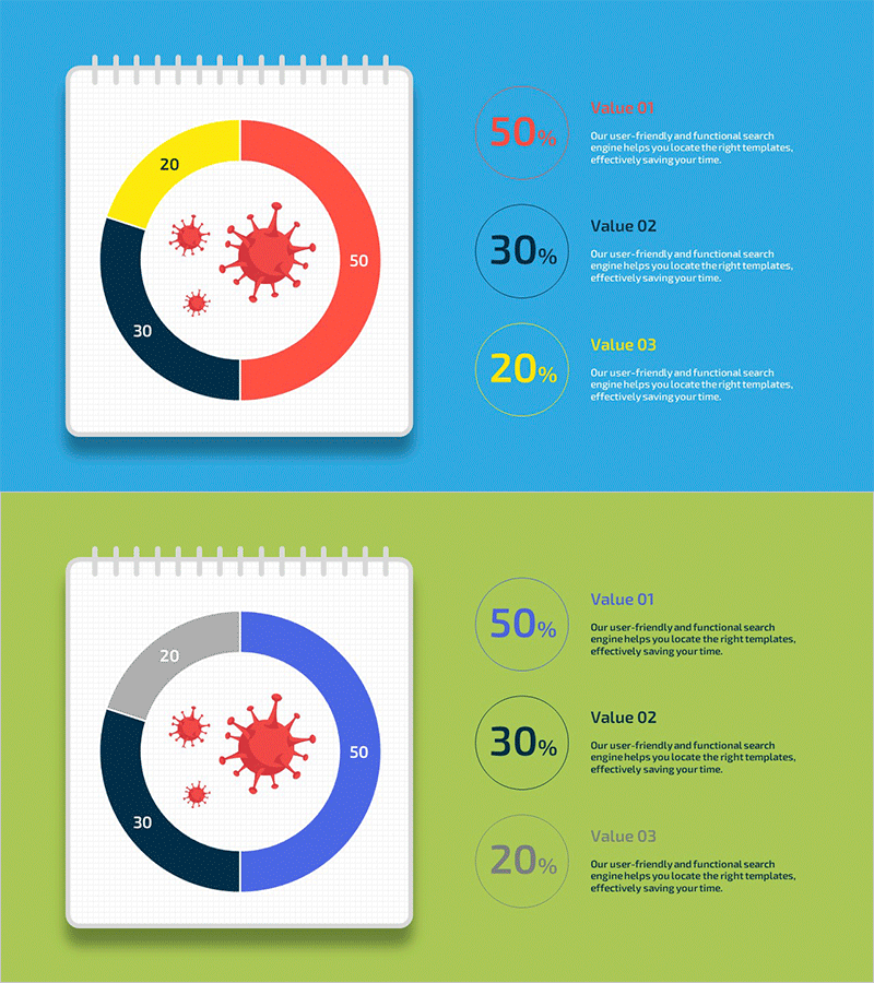
A donut chart PowerPoint slide visualizing COVID-19 virus types with a central virus icon and four outer segments (50%, 30%, 20%, and additional ratio) representing data distribution. The design uses a four-color palette—blue, red, yellow, and dark navy—to distinguish each category, with circular labels and descriptive text positioned on the right side. Two slide layouts are provided: one with a bright blue background and another with a lime green background, allowing you to match your presentation theme. The 16:9 widescreen PPTX format is fully editable and ready to use. Ideal for market analysis, infection rate statistics, type distribution, and other ratio-based data visualization in business presentations, healthcare reports, and analytical decks.
Usage Points
-
Main Usage
The donut chart clearly expresses the proportion and composition of each item relative to the whole. A central icon emphasizes the topic, while color-coded outer segments enable intuitive category distinction. Optimized for ratio-based data representation in statistics, analysis, and market overview presentations.
-
How to Use
Use this slide in the market analysis, current status analysis, or composition ratio sections of your presentation. Edit the donut segments' colors and percentages to match your data, and update the right-side labels with your category names. Replace the central icon with a topic-relevant image to enhance visual consistency.
-
Recommended For
Recommended for marketing, sales, and planning professionals presenting market analysis; healthcare and public health statistics; executive reports showing composition ratios; and educational seminars requiring data visualization. The two background options (blue and lime green) allow alignment with corporate brand colors.
-
Slide Structure
Two-slide set with Slide 1 featuring a blue background and Slide 2 with a lime green background. Each slide displays a donut chart on the left (central virus icon plus four-segment outer ring) and three circular labels on the right (50%, 30%, 20% with descriptive text) in a two-column layout. Optimized for 16:9 widescreen display.
Related Products
-

Comparative Analysis of Composition Contents Pie Chart – Market and Competitor Analysis
#Product/Service Introduction #Market and Competitor Analysis #Graph
-

Security Business Composition Pie Chart – Market and Competitor Analysis
#Product/Service Introduction #Market and Competitor Analysis #Graph
-

Science Experiment Analysis Circle Graph – Market and Service Introduction
#Product/Service Introduction #Market and Competitor Analysis #Graph
-

Rocket Research Progress Pie Chart – Market and Service Analysis
#Product/Service Introduction #Market and Competitor Analysis #Graph
