Vertical Bar Chart Slide for Effective Data Visualization
RJ0700021_23
- Last Update 07/28/2025
- File Size 0.7MB
- # of Slides 2
- File Format PPTX
- Slide Ratio 16:9
- Color
Keywords
- #Content-Based Slides
- #Design-Based Slides
- #Market and Competitor Analysis
- #Graph
- #Competitor Analysis
- #Market Analysis
- #Column
- #Grouped Column
- #16:9
- #vertical bar chart PowerPoint
- #bar graph slide template
- #data visualization presentation
- #business report chart
- #comparison chart download
- #data analysis slide
About the Product
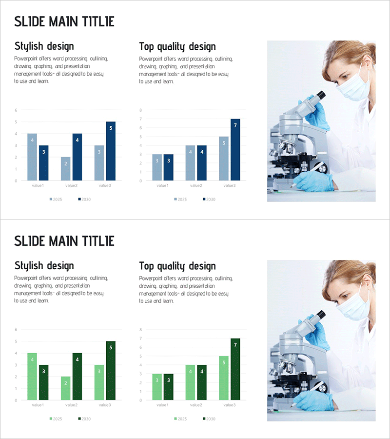
A professional vertical bar chart PowerPoint slide designed for business reports and data analysis presentations. This slide features a dual-series comparison with light blue and dark navy bars representing three data items, ideal for comparing 2025 and 2030 figures side by side. Two design versions are provided—'Stylish Design' and 'Top Quality Design'—allowing you to choose the layout that best fits your presentation context. Delivered in 16:9 widescreen PPTX format, the slide is fully editable and ready to use. Simply replace the sample data with your actual figures to create a professional-grade presentation in minutes.
Usage Points
-
Main Usage
Ideal for annual performance comparisons, departmental results analysis, market data visualization, and budget-versus-actual reporting. The vertical bar format makes numerical differences immediately apparent, while the dual-series design clearly shows trends and variations across comparison periods.
-
How to Use
Open the slide and replace the sample data with your actual figures. Modify the legend labels (2025/2030) to match your project timeline or comparison categories. The blue and navy color scheme can be retained or customized to match your corporate branding guidelines.
-
Recommended For
Financial analysts, marketing managers, project managers, business executives, consultants, and academic presenters who need to communicate quantitative data effectively. Perfect for quarterly earnings reports, annual business reviews, market research presentations, and performance dashboards.
-
Slide Structure
2-slide set with dual design versions. Each slide displays a grouped vertical bar chart with 3 data items (value1, value2, value3) and 2 series (2025, 2030). Bars are arranged side-by-side for direct comparison, with clear axis labels and legend indicators.
Related Products
-

Business Plan Competitor Analysis Chart – Effective Market Analysis Tool
#Market and Competitor Analysis #Diagram #Graph
-

Vertical Bar Chart for Future Growth Prediction – Innovative Vision
#Market and Competitor Analysis #Graph #Competitor Analysis
-

Competitor Brand Product Comparison Analysis Graph
#Market and Competitor Analysis #Graph #Competitor Analysis
-

Infographic Slide Highlighting Visualized Data – Modern Design
#Market and Competitor Analysis #Graph #Competitor Analysis
