Space Industry Technology Status Graph – The Start of Innovation
RJ0700015_18
- Last Update 07/26/2025
- File Size 0.7MB
- # of Slides 2
- File Format PPTX
- Slide Ratio 16:9
- Color
Keywords
- #Content-Based Slides
- #Design-Based Slides
- #Product/Service Introduction
- #Market and Competitor Analysis
- #Graph
- #Development Status
- #Market Share
- #Circles
- #Doughnut Chart
- #16:9
- #donut chart PowerPoint slide
- #pie chart template
- #data visualization slide
- #multi-color graph
- #market share chart
- #how to create donut chart in PowerPoint
About the Product
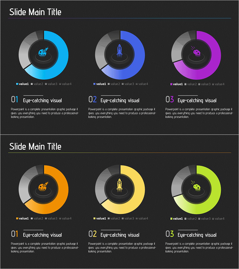
A donut chart PowerPoint slide designed to visualize space industry technology status and market distribution. The dark background features six color segments—cyan, blue, purple, orange, yellow, and lime—representing proportional data such as market share, technology distribution, and industry breakdown. The central icon and legend layout make it ideal for presentations, business reports, and technology analysis documents. The 2-slide set enables multiple data scenarios and comparative analysis.
Usage Points
-
Main Usage
Visualizes proportional data such as market share, technology distribution, budget allocation, and industry breakdown. The central icon area emphasizes the topic, while the legend clearly presents multiple data categories in a single, comprehensive view.
-
How to Use
Apply to technology status reports, business presentations, investor pitch decks, and market research summaries. Double-click each color segment to edit values and labels. Replace the central icon to customize by industry or department. Modify legend text to match your data categories.
-
Recommended For
Technology executives, business development teams, marketing professionals, consultants, and financial analysts presenting quantitative data. Ideal for organizations in aerospace, IT, manufacturing, and finance requiring market analysis and technology landscape presentations.
-
Slide Structure
2-slide set. Each slide features a 6-segment donut chart with a central icon placeholder and bottom legend (value1–value4 labels). Slide 1 uses cyan, blue, and purple; Slide 2 uses orange, yellow, and lime to support diverse data representation scenarios.
Related Products
-

Map Donut Graph for Visualizing Market Share – Symbol of Practicality and Change
#Product/Service Introduction #Market and Competitor Analysis #Graph
-

Space Exploration Donut Pie Chart
#Product/Service Introduction #Market and Competitor Analysis #Graph
-

Sales Status Analysis Graph – Simple and Stylish Design
#Product/Service Introduction #Market and Competitor Analysis #Graph
-

Analysis graph of market share progress
#Product/Service Introduction #Market and Competitor Analysis #Graph
