Introducing Medical Staff Analysis Data – Insights from Experts
RJ0700014_4
- Last Update 07/26/2025
- File Size 3.2MB
- # of Slides 2
- File Format PPTX
- Slide Ratio 16:9
- Color
Keywords
- #Content-Based Slides
- #Design-Based Slides
- #Company Introduction
- #Market and Competitor Analysis
- #Diagram
- #Graph
- #Manpower
- #Customer Analysis
- #Cluster
- #Horizontal Bar
- #Closed Cluster Diagram
- #Horizontal Bar Chart
- #16:9
- #medical staff analysis chart PowerPoint
- #horizontal bar graph slide
- #healthcare data visualization
- #hospital operational report template
- #data comparison presentation slide
About the Product
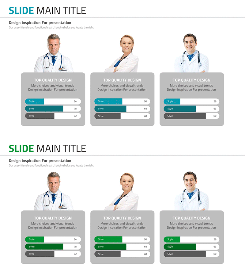
A horizontal bar chart PowerPoint slide for visualizing medical facility workforce analysis and performance metrics. This presentation template displays three data categories (Style) in teal and gray dual-tone design, with numerical values ranging from 0 to 100 for each item. Ideal for hospital operational reports, healthcare data presentations, customer analysis briefings, and market analysis slides. The 2-slide set includes color variations (teal and green accents) optimized for 16:9 widescreen format, enabling quick customization of medical staff distribution, departmental performance, and organizational structure data.
Usage Points
-
Main Usage
This slide compares and analyzes three data categories related to medical facility workforce composition, departmental status, and organizational hierarchy using horizontal bar charts. It effectively communicates quantitative information in hospital management reports, healthcare data presentations, and customer analysis materials.
-
How to Use
Apply this slide to the workforce section of hospital operational reports, organizational analysis portions of healthcare facility introductions, and comparative analysis of target demographics in customer analysis materials. Edit the numerical values to match your actual data and use immediately in presentations.
-
Recommended For
Hospital administrators, healthcare facility marketing managers, medical data analysts, healthcare consultants, and medical institution planning teams presenting workforce composition, departmental performance, and customer segment analysis.
-
Slide Structure
The 2-slide set features horizontal bar charts with three data items on each slide. The first slide emphasizes teal color accents, while the second features green accents for design variation. Each bar displays numerical data on a 0–100 scale, arranged within gray background boxes for clear visual hierarchy.
Related Products
-

Graph Slide for User Data Analysis – Visual Trends and Appeal
#Company Introduction #Market and Competitor Analysis #Diagram
-

Horizontal Bar Chart for Professional Team Human Resources Analysis
#Company Introduction #Market and Competitor Analysis #Diagram
-

Work Capabilities Analysis Diagram – Analysis of Key Personnel Work Performance
#Company Introduction #Market and Competitor Analysis #Diagram
-

Key Personnel Work Competency Assessment Slide - Customer Analysis and Manpower
#Company Introduction #Market and Competitor Analysis #Diagram
