Graph Slide for User Data Analysis – Visual Trends and Appeal
RJ0400056_9
- Last Update 06/02/2025
- File Size 0.4MB
- # of Slides 2
- File Format PPTX
- Slide Ratio 16:9
- Color
Keywords
- #Content-Based Slides
- #Design-Based Slides
- #Company Introduction
- #Market and Competitor Analysis
- #Diagram
- #Graph
- #Manpower
- #Customer Analysis
- #Cluster
- #Horizontal Bar
- #Closed Cluster Diagram
- #Horizontal Bar Chart
- #16:9
- #horizontal bar chart PowerPoint
- #user data analysis slide
- #comparison chart template
- #data visualization PPT
- #how to create bar chart in PowerPoint
- #business analytics slide download
About the Product
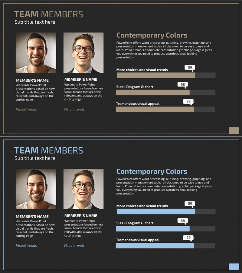
A horizontal bar chart PowerPoint slide designed for user data analysis and comparison. This template displays three data items side-by-side, making it ideal for market analysis, customer segmentation, and technology evaluation presentations. The dark background with beige and blue bar colors emphasizes data values, while score indicators (89, 68, 89) provide instant visual reference. The 2-slide PPTX template in 16:9 ratio is fully editable and optimized for analytics sections in business presentations, enabling clear visualization of key performance metrics.
Usage Points
-
Main Usage
Compares quantitative user data across three dimensions—such as customer behavior, preference scores, or satisfaction ratings—using bar length and numerical indicators. This dual-representation approach strengthens audience comprehension of comparative metrics in market research, customer analysis, and technology assessments.
-
How to Use
Insert this slide into the analysis or results section of your presentation. Modify bar lengths to reflect actual data values, update item labels, and adjust score numbers as needed. The dark professional tone suits corporate presentations, investor pitches, and executive briefings.
-
Recommended For
Marketing professionals, data analysts, product managers, and business executives presenting customer insights, market research findings, or performance evaluations. Ideal for startup pitch decks, strategic planning meetings, and academic research presentations requiring quantitative data visualization.
-
Slide Structure
Two-slide layout featuring a title area paired with a three-item horizontal bar chart. Each bar is color-coded (beige and blue) with corresponding score values displayed on the right (89, 68, 89). The second slide offers a layout variation for presenting additional comparative datasets.
Related Products
-

Work Capabilities Analysis Diagram – Analysis of Key Personnel Work Performance
#Company Introduction #Market and Competitor Analysis #Diagram
-

Introducing Medical Staff Analysis Data – Insights from Experts
#Company Introduction #Market and Competitor Analysis #Diagram
-

Horizontal Bar Chart for Professional Team Human Resources Analysis
#Company Introduction #Market and Competitor Analysis #Diagram
-

Human Resources Data Analysis - Effective Customer Management Strategies
#Company Introduction #Market and Competitor Analysis #Diagram
