Acupuncture Effect Analysis Graph - Healing and Recovery
RJ0700011_27
- Last Update 07/24/2025
- File Size 0.7MB
- # of Slides 2
- File Format PPTX
- Slide Ratio 16:9
- Color
Keywords
About the Product
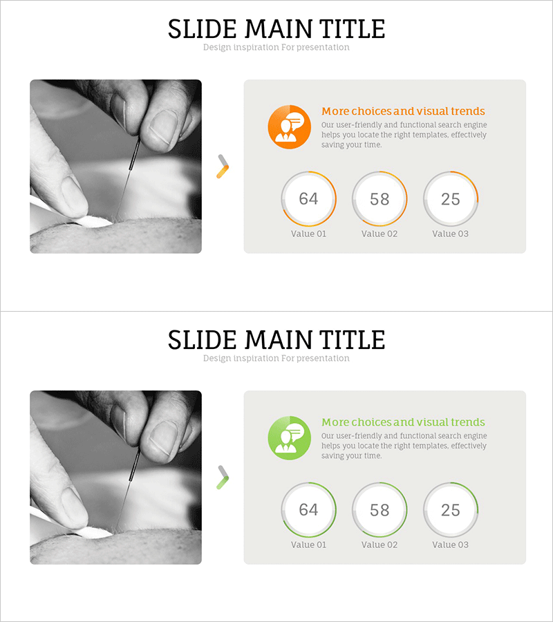
A professional PowerPoint slide featuring a 3-segment donut chart for visualizing proportional data across three categories. The design combines a grayscale image on the left with data visualization on the right, using orange and green accent colors to represent different data segments (64, 58, 25). This two-column layout integrates storytelling with quantitative analysis, making it ideal for healthcare, medical analysis, and performance reporting presentations. The 2-slide set is fully editable in PPTX format and ready for immediate use in clinical reports, wellness initiatives, and treatment outcome presentations.
Usage Points
-
Main Usage
Visualize proportional data and comparative metrics in healthcare, medical research, and wellness presentations using a clear 3-segment donut chart. The two-column layout combines visual storytelling with quantitative data, enabling audiences to quickly grasp both context and numerical insights in clinical or treatment outcome reports.
-
How to Use
Insert this slide into the analysis or results section of your presentation when comparing three data categories or showing proportional breakdowns. Replace the grayscale image with relevant medical or healthcare photography, update the numerical values (64, 58, 25) with your actual data, and adjust the orange and green colors to match your brand guidelines if needed.
-
Recommended For
Healthcare professionals, medical researchers, clinical analysts, wellness program managers, treatment outcome presenters, and healthcare marketing specialists. Particularly suited for acupuncture clinics, traditional medicine practitioners, rehabilitation centers, dermatology practices, and any health-related organization presenting effectiveness data or patient outcome metrics.
-
Slide Structure
Two-slide set with consistent layout: left side features a grayscale medical or healthcare-related image; right side displays a donut chart with 3 segments in orange or green tones. Each segment displays numerical values (customizable). Title area at top, optional legend or descriptive text at bottom. All elements are fully editable and can be resized or repositioned.
Related Products
-

Business Development Status Donut Graph – A Template for Visual Communication
#Product/Service Introduction #Business Introduction #Diagram
-

Development Status Donut-shaped Circle Graph
#Product/Service Introduction #Market and Competitor Analysis #Graph
-

Visualizing Company Service Development Status with Diagrams
#Company Introduction #Product/Service Introduction #Diagram
-

Space Industry Development Status Graph – Capturing the Future of Industry
#Product/Service Introduction #Business Introduction #Graph
