Purple Green Party Gauge Chart
RJ0600108_26
- Last Update 07/20/2025
- File Size 0.1MB
- # of Slides 2
- File Format PPTX
- Slide Ratio 16:9
- Color
Keywords
About the Product
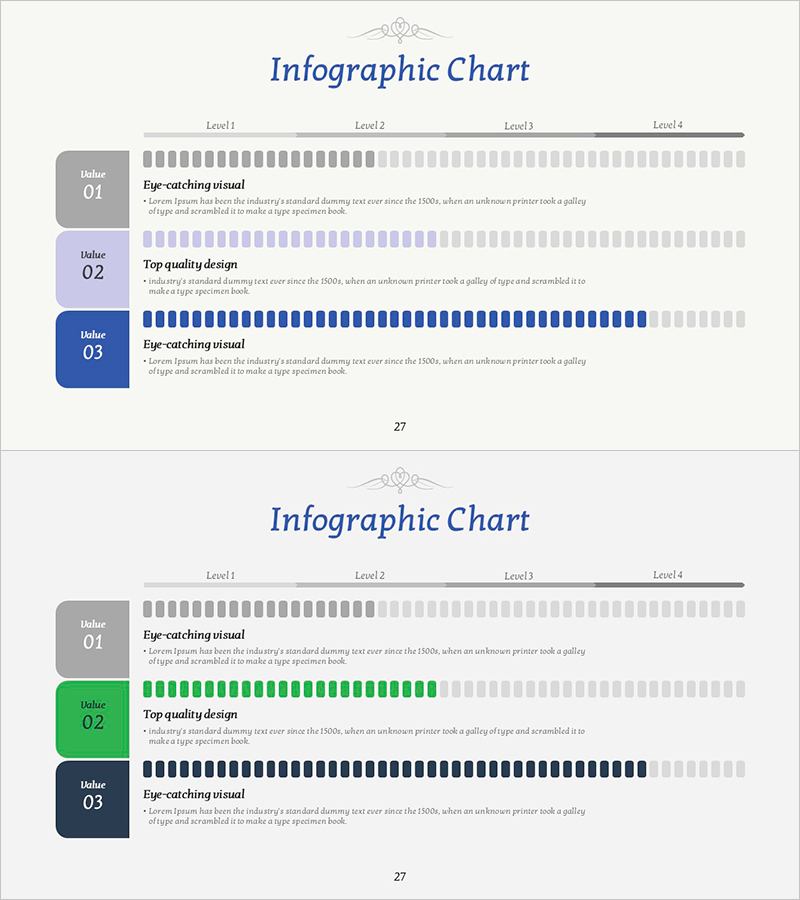
A horizontal gauge chart PowerPoint slide that visualizes progress rates, achievement levels, and performance metrics across three items. Each gauge bar is color-coded in purple, green, and navy blue for clear distinction. The left side features label areas for item names, while the right side displays horizontal gauge bars representing 0–100% data ranges. This 2-slide template is ideal for business presentations, performance reports, and progress tracking in various professional contexts.
Usage Points
-
Main Usage
Display quantitative data such as project progress, goal achievement, performance indicators, and competency assessments across three categories. The gauge bar length communicates numerical values intuitively, making it effective for executive reports, performance presentations, and business status updates.
-
How to Use
Enter item names (e.g., sales achievement rate, customer satisfaction, project progress) in the left label area. Adjust the gauge bar length to match your data values. Retain the purple, green, and navy color scheme or customize with your brand colors. All text and numerical values are fully editable.
-
Recommended For
Recommended for executives, managers, and project leaders presenting team performance, goal achievement status, and KPI metrics. Ideal for quarterly performance reports, business plan presentations, performance review meetings, and investor pitch decks to enhance data credibility.
-
Slide Structure
2-slide template with identical layouts. Each slide contains 3 gauge chart items arranged horizontally. Layout includes left label area (item names), center horizontal gauge bars (purple, green, navy), and right numerical input area for data entry.
Related Products
-

Key Shape Diagram for Delivering Vision and Mission
#Company Introduction #Product/Service Introduction #Diagram
-

Galaxy Theme Brain Structure Explanation Connection Diagram – Innovation and Insight
#Business Introduction #Diagram #Technological Status
-

Business Program Introduction Slides – Visualizing Program Structure
#Product/Service Introduction #Business Introduction #Diagram
-

SWOT Analysis Connection Diagram – Essential for Market and Competitive Analysis
#Market and Competitor Analysis #Diagram #SWOT Analysis
