Orange Line Chart Set – Market Trend Analysis
RJ0600100_17
- Last Update 07/18/2025
- File Size 0.4MB
- # of Slides 2
- File Format PPTX
- Slide Ratio 16:9
- Color
Keywords
About the Product
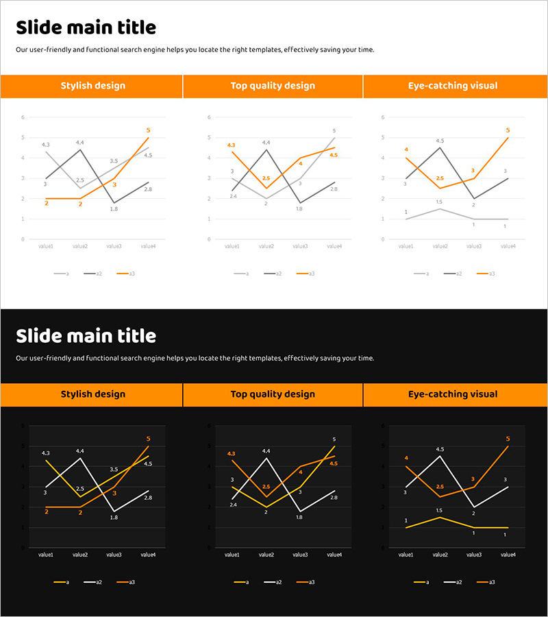
A 3-series line chart PowerPoint slide designed to visualize market trends and competitive advantages. The chart features an orange accent line paired with gray and black comparison lines, clearly showing data change patterns across four data points. This 2-slide set includes both white and black background versions, each with a complete line graph and legend. Ideal for presentations, reports, and business proposals where you need to communicate numerical changes and performance trends effectively.
Usage Points
-
Main Usage
This slide effectively compares time-series data across three metrics—such as market trends, sales performance, or growth rates—using a multi-line format. The orange accent line highlights your primary metric while gray and black lines provide context for competitor or historical comparison. Perfect for reports, strategic plans, and investor presentations where demonstrating directional change and magnitude of data is critical.
-
How to Use
Replace the 'Market Trend Analysis' title at the top with your presentation topic. Update the legend labels (value1, value2, value3) to match your actual metrics. Modify the four data points on each line, and the chart will automatically adjust. Use the white background version for bright conference rooms and online presentations, and the black background for executive briefings requiring a premium appearance.
-
Recommended For
Ideal for executives, marketing teams, sales departments, and strategic planning units presenting quarterly or annual performance analysis, market share evolution, customer satisfaction trends, and product sales comparisons. Also suitable for consulting reports, investor pitch decks, and business plans where market analysis sections require data-driven competitive positioning.
-
Slide Structure
2-slide set with identical chart structure. Each slide features an orange header bar (title area), a central line graph with 4 data points on the X-axis, Y-axis scale 0–5, and 3 data series, plus a legend at the bottom (value1, value2, value3). The first slide has a white background; the second has a black background, allowing flexible selection based on presentation context.
Related Products
-

Idea Presentation Template Wide Line Chart
#Market and Competitor Analysis #Graph #Industry Trends
-

Dual Line Chart with Comments – Market Trend Analysis
#Market and Competitor Analysis #Graph #Text Box
-

Line Chart Template for Market Trends Visualization – Enhancing Competitive Advantage
#Market and Competitor Analysis #Graph #Industry Trends
-

Market Trend Line Graph – Effective Competitive Advantage Analysis
#Market and Competitor Analysis #Graph #Industry Trends
