Visualizing 2028 Design Inspiration with Bar Graphs - Contemporary Colors
RJ0600093_16
- Last Update 07/15/2025
- File Size 0.4MB
- # of Slides 2
- File Format PPTX
- Slide Ratio 16:9
- Color
Keywords
About the Product
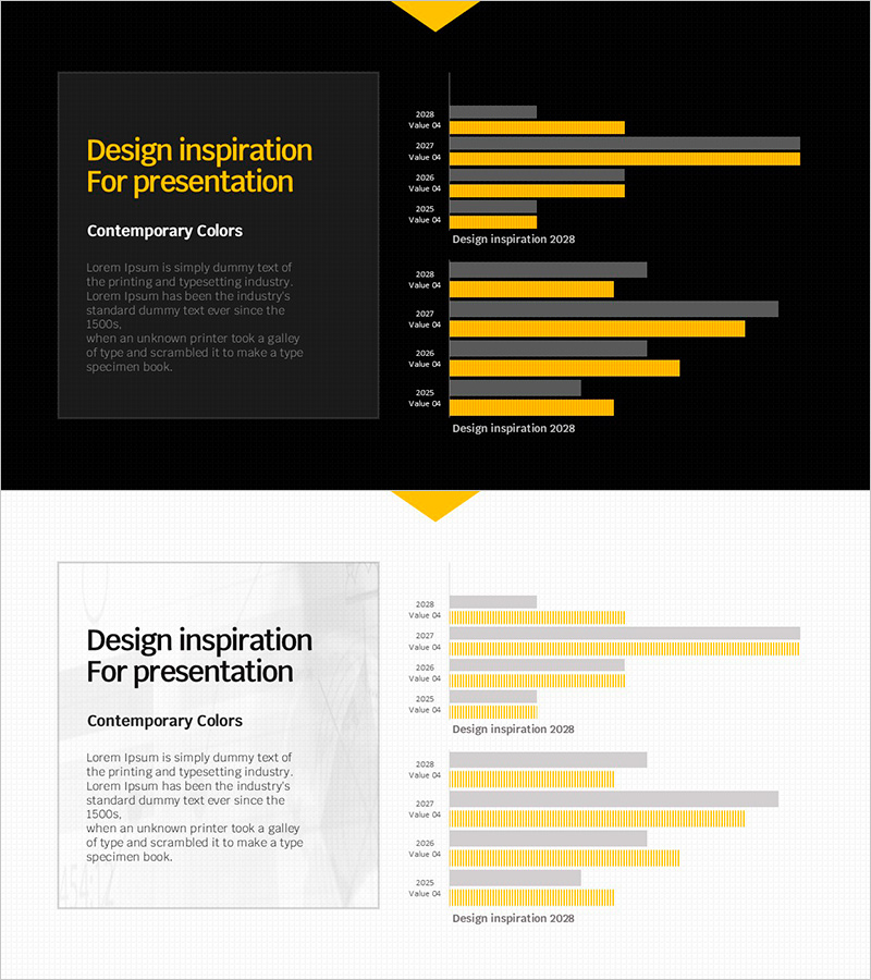
This free horizontal bar graph PowerPoint slide enables you to compare year-over-year data at a glance. Featuring a contemporary yellow and gray two-tone color scheme, it combines a title section on the left with a balanced graph area on the right. Simply replace the text and values to create a professional presentation slide instantly. Three background versions—dark, light, and grid—are included to match any presentation context. Perfect for business performance reports, marketing plans, investor pitch decks, and quarterly reviews. Explore more chart variations and premium graph slide collections at GoodPello for expanded visualization options.
Usage Points
-
Main Usage
Visualize year-over-year, monthly, or departmental data using horizontal bar graphs to clearly communicate comparative analysis results. Ideal for performance reports, results analysis, and goal achievement tracking.
-
How to Use
Replace the left-side title, subtitle, and description text with your presentation topic. Update the year labels and numerical values in the right-side graph with your actual data. Select from dark, light, or grid background versions based on your presentation context.
-
Recommended For
Business performance reports, marketing plans, investor presentations, quarterly and annual reviews, results analysis presentations, and any data-driven presentations for professionals across all organizational levels.
-
Slide Structure
Single-slide composition with a 40% left text area (title, subtitle, description) and 60% right graph area featuring two horizontal bar chart sets with four-year data points.
Related Products
-

Market Analysis by Year Horizontal Bar Graph
#Free Graphs
-

Competitive Advantage Bar General Graph – Emphasizing Performance through Market Analysis
#Free Graphs
-

Business Comparison Analysis Graph – Strengthening Market and Competitor Analysis
#Free Graphs
-

Market Analysis Graph – Harmony of Pink and Bluegreen
#Free Graphs
