Share Chart Comparison – Visual Data Analysis
RJ0600090_7
- Last Update 07/15/2025
- File Size 1.7MB
- # of Slides 2
- File Format PPTX
- Slide Ratio 16:9
- Color
Keywords
About the Product
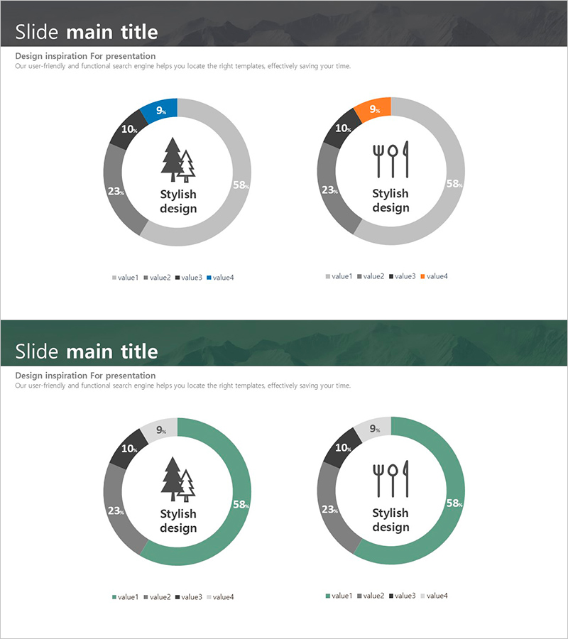
A PowerPoint slide featuring donut-shaped pie charts for visualizing market share and proportional data across four categories. The design uses a multi-color palette of gray, blue, and orange tones to clearly differentiate data segments, with central icon and text placement to emphasize key messages. The 2-slide set enables side-by-side comparison and analysis, complete with data labels and legend. Delivered in 16:9 widescreen PPTX format, all colors and values are fully editable for immediate use in presentations, reports, and business proposals.
Usage Points
-
Main Usage
Visualize proportional data such as market share, revenue distribution, category breakdown, and segment composition using donut-shaped pie charts. Central icon area highlights the main topic while color-coded segments enable instant comparison of four data points.
-
How to Use
Deploy in quarterly business reports, marketing strategy presentations, performance reviews, and market analysis decks. The 2-slide format supports year-over-year comparisons, competitive benchmarking, departmental performance analysis, and portfolio composition explanations.
-
Recommended For
Ideal for executives, marketing teams, sales departments, analysts, and business planners presenting data-driven insights. Effective for quarterly earnings reports, market positioning analysis, customer segmentation, and product portfolio distribution.
-
Slide Structure
Two donut chart slides with 4 data series each (value1–value4) rendered in multi-color segments. Central icon area (tree and utensil icons) with surrounding numeric labels (9%, 10%, 23%, 58%) and legend. Delivered in 16:9 widescreen format with full editability.
Related Products
-

Sales and Profit Comparison Graph & Table – Clear Financial Analysis
#Financial Plans and Performance #Diagram #Graph
-

Mint Green Mixed Graph – Market Status Analysis
#Market and Competitor Analysis #Graph #Other
-

Day and Night Phase Cumulative Progress – Data Visualization for Business Success
#Business Strategy #Market and Competitor Analysis #Graph
-

Ice Hockey Performance Graph – Competitiveness and Advantage
#Market and Competitor Analysis #Graph #Competitor Analysis
