Three-Color Horizontal Bar Graph for Visualizing Sales Status – Business Insights
RJ0600090_5
- Last Update 07/15/2025
- File Size 8.2MB
- # of Slides 2
- File Format PPTX
- Slide Ratio 16:9
- Color
Keywords
About the Product
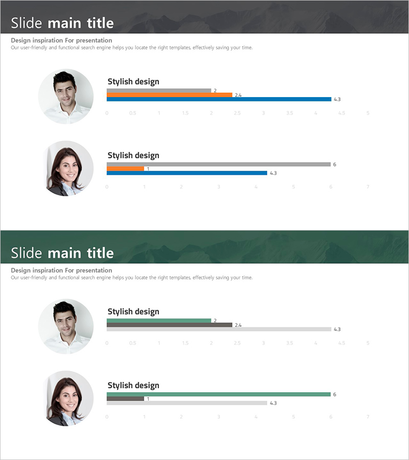
A horizontal bar chart PowerPoint slide featuring three color series: orange, blue, and gray. This 2-slide template visualizes multiple data sets such as sales performance, departmental results, and product comparisons at a glance. Each bar includes numeric labels, with gray background bars representing both targets and actuals simultaneously. Optimized for business presentations that clearly communicate data insights and performance metrics in reports and executive briefings.
Usage Points
-
Main Usage
Compares and ranks multiple data items in horizontal orientation. Three color series (orange, blue, gray) represent actuals, targets, and other metrics simultaneously, enabling intuitive communication of complex data analysis.
-
How to Use
Used in sales reports, departmental performance comparisons, product sales analysis, quarterly performance trends, and business meetings. Fully editable structure—update numbers and the chart refreshes automatically.
-
Recommended For
Sales, marketing, and finance professionals; executive briefings; quarterly and annual performance presentations; investor relations; business planning presentations.
-
Slide Structure
2-slide layout. Each slide contains 2–3 horizontal bar charts with color-coded series: orange (primary metric), blue (comparison metric), gray (target/baseline). Numeric labels appear at bar ends for precise data reading.
Related Products
-

Customer Analysis with Horizontal and Vertical Bar Graphs – Market and Competitor Analysis
#Market and Competitor Analysis #Marketing Plan and Strategy #Diagram
-

Data Market Analysis Circle Chart – Insightful Visuals
#Product/Service Introduction #Market and Competitor Analysis #Graph
-

Donut Chart by Lighting Sales Rankings – Market Data Analysis
#Market and Competitor Analysis #Financial Plans and Performance #Diagram
-

User Analysis Graph by Age Group – Advanced Data Insights
#Market and Competitor Analysis #Diagram #Graph
