Pink Blue Area Solo Chart – Stylish Design
RJ0600084_21
- Last Update 07/13/2025
- File Size 1.2MB
- # of Slides 2
- File Format PPTX
- Slide Ratio 16:9
- Color
Keywords
About the Product
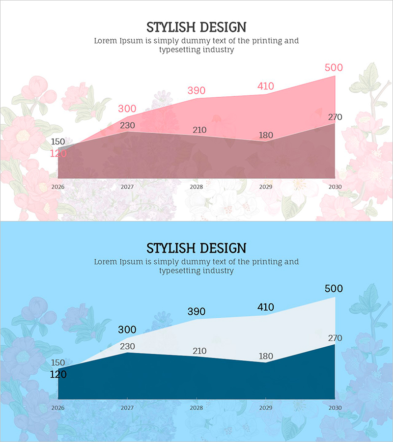
A professional area chart PowerPoint slide displaying two data series in pink and blue gradient tones. This slide effectively visualizes five-year trends from 2026 to 2030, with each data point clearly labeled with numerical values. The dual-layer area design allows viewers to compare cumulative values and track changes over time intuitively. Decorative floral illustrations frame the chart, adding visual polish to your presentation. Two slide variations are included—one with a soft pink background and one with a cool blue background—enabling you to match your presentation theme. Perfect for business reports, marketing analysis, financial presentations, and performance reviews where data trends need clear visual communication.
Usage Points
-
Main Usage
Designed to compare and analyze cumulative data trends across two or more series over time. The area fill technique makes it easy to perceive relative magnitude and cumulative totals at a glance, making it ideal for revenue trends, customer growth, market share evolution, and budget allocation comparisons.
-
How to Use
Use the pink-background version for warm, creative presentations and the blue-background version for corporate, trustworthy contexts. Replace the sample data points with your own figures, update axis labels and legend text to match your presentation context, and adjust or remove the floral background as needed. All elements are fully editable in PowerPoint.
-
Recommended For
Finance analysts, marketing managers, business executives, management consultants, and educators presenting performance metrics, market trends, or business results. Particularly effective for industries targeting female audiences—beauty, fashion, lifestyle, wellness—where visual aesthetics enhance credibility and engagement.
-
Slide Structure
Each slide features a centered title area (STYLISH DESIGN), descriptive subtitle text, and a dual-layer area chart. The X-axis displays years (2026–2030), the Y-axis shows values (120–500), with an upper pink gradient area and lower mauve/navy area overlapping to show cumulative trends. All data points are labeled with precise numerical values for clarity.
Related Products
-

Planterior Market Overview – Insights through Horizontal Bar Graph
#Market and Competitor Analysis #Graph #Market Overview
-

Analysis of Ship Order Volume – Effective Market Status Graph
#Market and Competitor Analysis #Financial Plans and Performance #Graph
-

Strategic Market Analysis Bar Chart
#Market and Competitor Analysis #Graph #Market Status
-

Visual Summary of Metrics and Key Data Points – Slide for Data Analysis
#Graph
