Horizontal Bar Chart for Performance Visualization – Driving Business Momentum
RJ0600077_5
- Last Update 07/10/2025
- File Size 6.6MB
- # of Slides 2
- File Format PPTX
- Slide Ratio 16:9
- Color
Keywords
- #Content-Based Slides
- #Design-Based Slides
- #Business Strategy
- #Marketing Plan and Strategy
- #Graph
- #Achievements
- #Marketing Objectives
- #Column
- #Column Chart
- #16:9
- #clustered column chart PowerPoint
- #bar chart slide template
- #performance comparison chart
- #weekly data visualization
- #how to create column chart in PowerPoint
About the Product
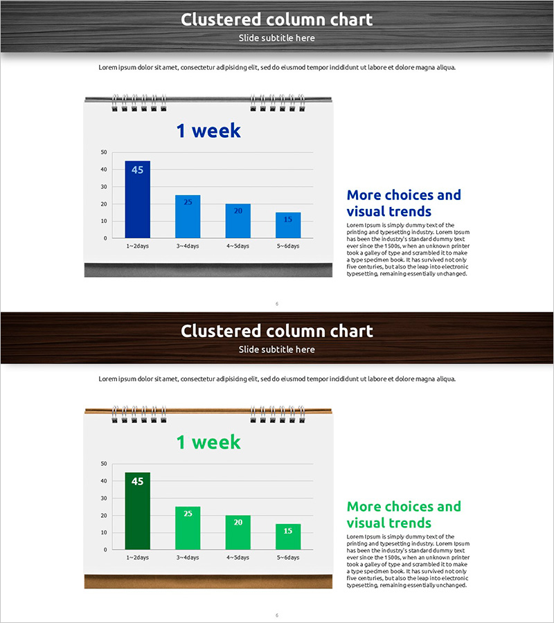
A clustered column chart PowerPoint slide designed to compare weekly performance across four key metrics. The slide uses a two-series data visualization with dark blue and light blue columns to clearly show period-over-period trends and performance gaps between categories. Ideal for presenting marketing goal achievement, business initiative progress rates, team performance benchmarks, and quarterly sales comparisons. The 2-slide deck is fully editable in PowerPoint and ready to insert into presentations and business reports without additional formatting.
Usage Points
-
Main Usage
Visualize weekly performance metrics by comparing multiple categories simultaneously. The chart enables quick identification of relative values and trends across marketing campaign results, sales targets, team productivity, and project milestones in a single view.
-
How to Use
Use in executive dashboards, marketing strategy presentations, and business performance review meetings to analyze weekly data comparisons. Simply input your numbers into PowerPoint and the column heights adjust automatically, enabling rapid report creation.
-
Recommended For
Marketing managers, sales directors, project managers, and business analysts presenting quantitative weekly performance data. Particularly effective for goal-vs-actual comparisons, departmental performance benchmarking, and campaign effectiveness measurement.
-
Slide Structure
2-slide template featuring clustered columns representing 4 time periods (1-24 days, 3-49 days, 4-54 days, 5-64 days) with 2 data series (dark blue and light blue). Grid background and legend enhance data readability. Right-side text area accommodates supporting commentary or key insights.
Related Products
-

Visualization of Major Sales Growth Segments – Performance and Strategy
#Business Strategy #Financial Plans and Performance #Graph
-

Current Accomplished Numerical Graph – Diagram Visualizing Achievements
#Business Strategy #Marketing Plan and Strategy #Diagram
-

Business Promotion Strategy Slide Template – Effective Information Delivery and Visual Composition
#Business Strategy #Graph #Other
-

Rainbow Paper Presentation Template Column Chart1 – Visualizing Market Trends
#Business Strategy #Market and Competitor Analysis #Graph
