Default Increasing Graph – Visualization of Quantitative Data
RJ0600071_14
- Last Update 07/08/2025
- File Size 2MB
- # of Slides 2
- File Format PPTX
- Slide Ratio 16:9
- Color
Keywords
About the Product
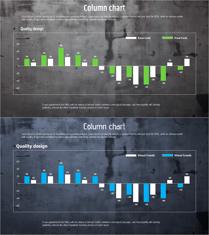
A dual-series column chart PowerPoint slide designed to visualize positive and negative values simultaneously. Available in two color schemes—green and white, or blue and white—to create visual contrast between gains and losses. The horizontal bar format accommodates up to 20 data points, enabling quick comparison of quantitative changes. Ideal for financial reports, performance analysis, and business presentations requiring immediate deployment.
Usage Points
-
Main Usage
Perfect for visualizing sales variance, profit margin analysis, market share fluctuations, and budget variance reports where both positive and negative metrics must be compared side-by-side. The two color palettes—green/white and blue/white—adapt to various corporate branding standards.
-
How to Use
Input numerical values for each category; the bar lengths adjust automatically. Integrate Excel data directly or manually edit values as needed. Customize axis labels and legend text to match your presentation context and data narrative.
-
Recommended For
Financial analysts, marketing managers, sales directors, and executives preparing quarterly reviews, regional performance comparisons, product line profitability assessments, and variance analysis presentations.
-
Slide Structure
Two-slide set featuring identical layouts in different color schemes: green/white and blue/white. Each slide displays up to 20 data categories with a symmetrical axis at zero—positive values extend rightward, negative values extend leftward, creating intuitive visual balance.
Related Products
-

Highlighted Blue Line Chart – Visual Trend Analysis
#Graph
-

A Male-Female Survey of Protein Intake – Gender Analysis
#Market and Competitor Analysis #Graph #Other
-

Gender Ratio Bar Graph – Market and Competitor Analysis
#Market and Competitor Analysis #Graph #Competitor Analysis
-

Country-by-country Status Analysis Map Template
#Company Introduction #Graph #Other
