Customer Type Analysis Bar Graph – Data Visualization for Customer Success
RJ0600065_10
- Last Update 07/07/2025
- File Size 0.4MB
- # of Slides 2
- File Format PPTX
- Slide Ratio 16:9
- Color
Keywords
- #Content-Based Slides
- #Design-Based Slides
- #Company Introduction
- #Market and Competitor Analysis
- #Customer Success Stories
- #Diagram
- #Graph
- #Manpower
- #Customer Analysis
- #Customer Testimonials and Feedback
- #Cluster
- #Column
- #Closed Cluster Diagram
- #Column Chart
- #16:9
- #customer analysis bar chart
- #customer type comparison chart
- #data visualization PowerPoint slide
- #customer success presentation
- #bar graph template download
About the Product
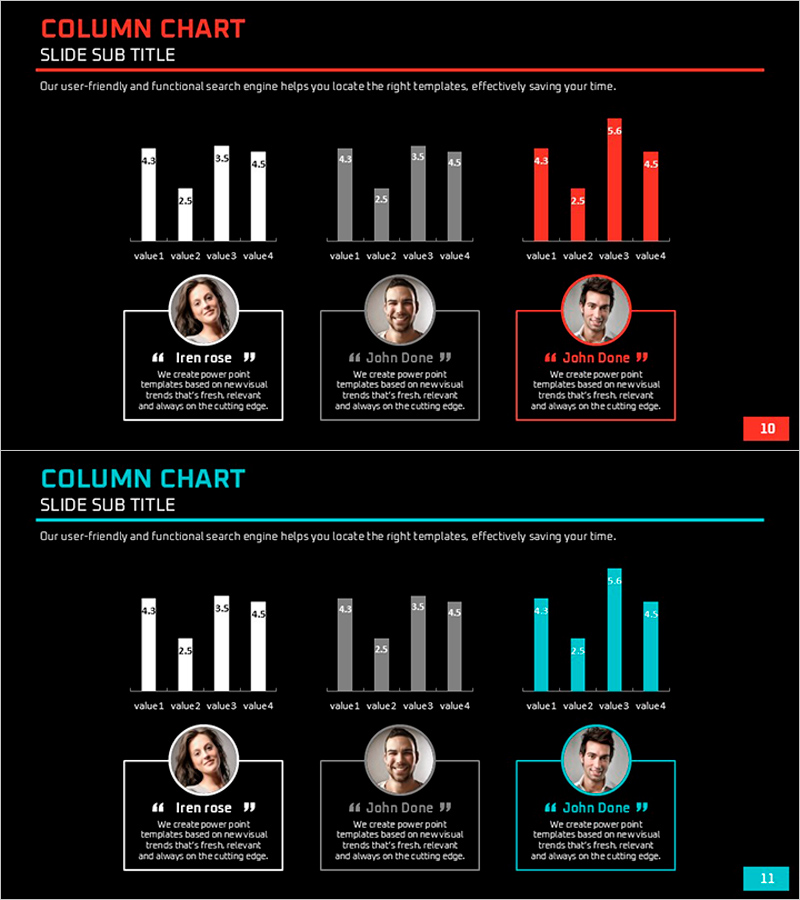
A data visualization PowerPoint slide designed for customer success strategy presentations. Features three-series bar charts in white, gray, and accent colors (red/blue) that clearly compare customer type metrics. Each chart is paired with customer profile photos and testimonial quotes below, enabling storytelling around customer success cases. Composed of 2 slides in 16:9 widescreen format, fully editable in PPTX. Ideal for market analysis, customer segmentation, performance reporting, and investor pitches.
Usage Points
-
Main Usage
Visually compare and communicate customer segmentation analysis and performance metrics by customer type. The three-series bar chart simultaneously displays data across multiple customer segments while profile photos and quotes add qualitative customer success stories.
-
How to Use
Use in quarterly business reviews, customer segmentation strategy meetings, and investor pitches to explain customer portfolio composition. Simply replace chart values and profile information with your own data for immediate deployment.
-
Recommended For
Customer Success Managers, Sales Leaders, Marketing Strategists, and Business Development professionals who need to present customer analysis findings persuasively to executives, investors, and team members.
-
Slide Structure
Slide 1: Red/gray/white 3-series bar chart + 3 customer profiles (circular photos) + testimonial boxes. Slide 2: Blue/gray/white 3-series bar chart + 3 customer profiles + testimonial boxes. Both slides include title, subtitle, and descriptive text areas.
Related Products
-

Patient Information Slide – Cluster for Healthcare Improvement
#Company Introduction #Market and Competitor Analysis #Diagram
-

Graph Slide for User Data Analysis – Visual Trends and Appeal
#Company Introduction #Market and Competitor Analysis #Diagram
-

Key Customer Analysis Data Charts – Assessing Market and Competition
#Company Introduction #Market and Competitor Analysis #Diagram
-

Responsible Team Profile Slide
#Company Introduction #Market and Competitor Analysis #Diagram
