Paint Piano and Segmentation Bar Graph – Market Trend Analysis
RJ0600064_8
- Last Update 07/07/2025
- File Size 0.7MB
- # of Slides 2
- File Format PPTX
- Slide Ratio 16:9
- Color
Keywords
- #Content-Based Slides
- #Design-Based Slides
- #Market and Competitor Analysis
- #Graph
- #Market Analysis
- #Industry Trends
- #Horizontal Bar
- #Segmented Horizontal Bar
- #16:9
- #horizontal bar chart PowerPoint
- #segmented bar graph slide
- #4-item data comparison
- #market analysis chart
- #how to create bar chart in PowerPoint
About the Product
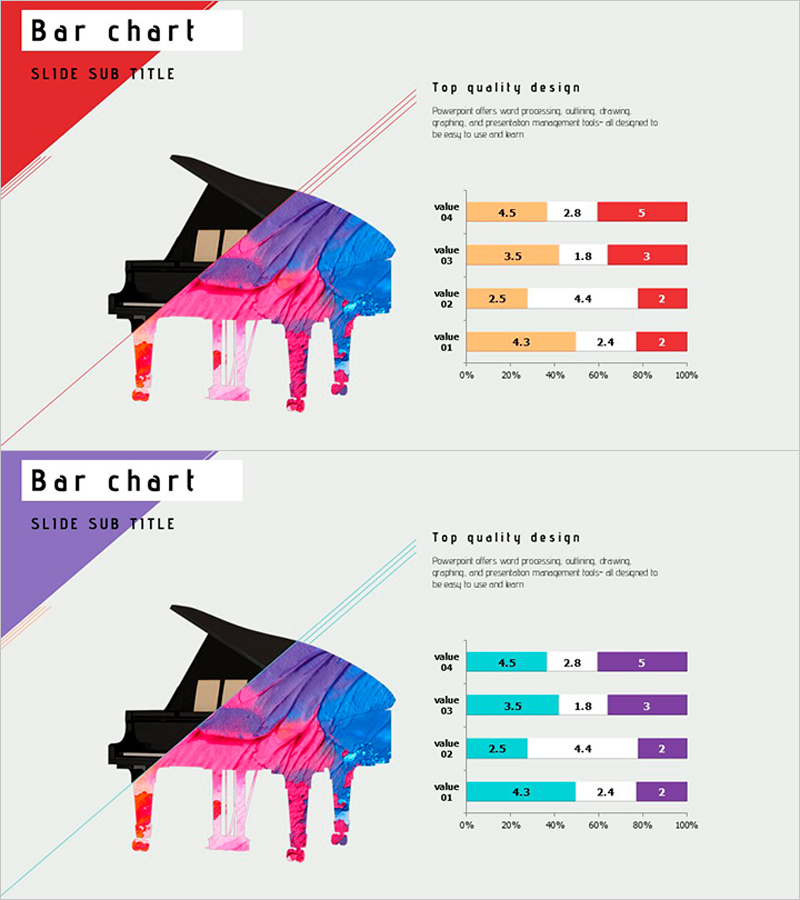
A horizontal bar chart PowerPoint slide optimized for market trend analysis and multi-series data comparison. This segmented bar graph features four items with three data series in orange, blue, and red colors, enabling clear visualization of complex datasets. The 0%–100% scale axis and numeric labels provide accurate value representation for market share, sales performance, and KPI metrics. Two slide layouts are included with different color schemes (red-purple and red-cyan themes) to match your presentation tone. Fully editable PPTX format allows instant customization of data and labels.
Usage Points
-
Main Usage
Compares multi-series data across four categories, such as market analysis, sales results, performance metrics, and budget allocation. The three-series structure allows simultaneous display of competitive benchmarks, quarterly trends, departmental performance, and other complex comparative datasets.
-
How to Use
Bar length and color intuitively represent numeric values against the 0%–100% scale axis. Numeric labels provide precise values for each segment. During presentation, explain the meaning of each color series, then highlight item-by-item differences to enhance audience comprehension of data relationships.
-
Recommended For
Marketing managers, sales directors, financial analysts, and executives preparing performance reports. Ideal for quarterly results presentations, market share analysis, budget execution reviews, departmental performance comparisons, and any data-driven business presentation.
-
Slide Structure
Two slides, each containing four horizontal bar items (value 04, 03, 02, 01). Each item displays three parallel bars in different colors (orange-blue-red or cyan-purple-red). A 0%–100% scale axis and numeric labels are clearly positioned for accurate data interpretation.
Related Products
-

Plant Horizontal Bar Chart – Understand Market Trends
#Market and Competitor Analysis #Graph #Market Analysis
-

Living Room Interior and Horizontal Cumulative Charts – Assessing Market Trends
#Market and Competitor Analysis #Graph #Market Analysis
-

Bar Chart Slide for Theme Park Market Trends
#Market and Competitor Analysis #Graph #Market Analysis
-

100% Stacked Bar Chart Abstract Pattern Presentation
#Market and Competitor Analysis #Graph #Other
