4 Basic Donuts Charts – Effective Data Visualization
RJ0600064_6
- Last Update 07/07/2025
- File Size 0.4MB
- # of Slides 2
- File Format PPTX
- Slide Ratio 16:9
- Color
Keywords
About the Product
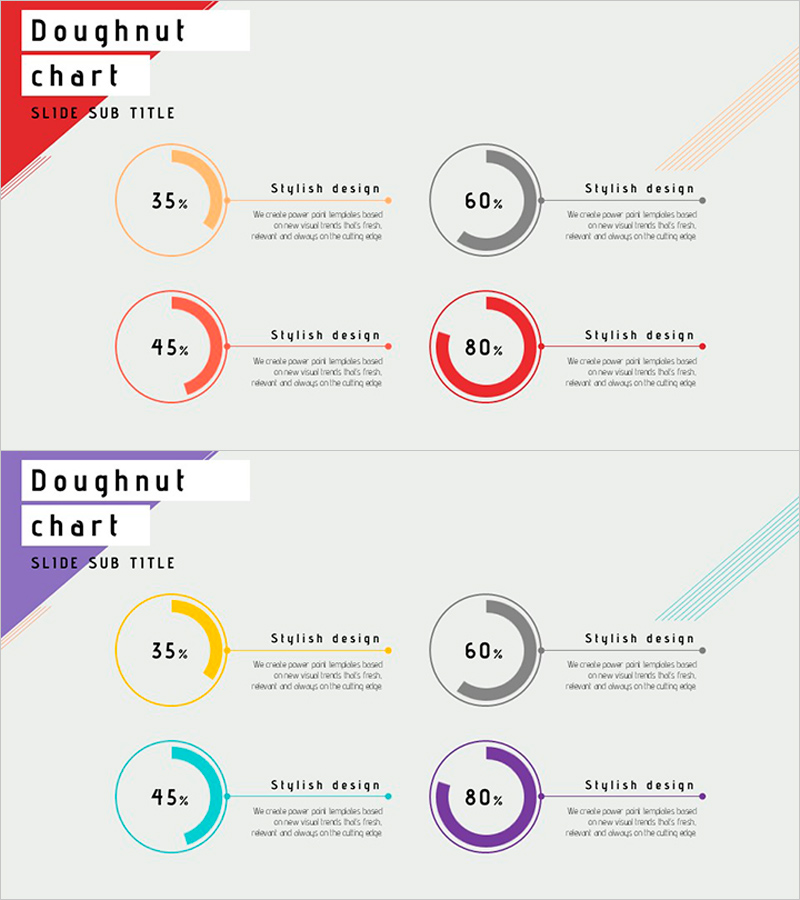
Essential doughnut chart PowerPoint slides for business presentations and data analysis. This 2-slide set features four pie-style donut graphs in orange, gray, red, and purple, displaying percentages of 35%, 60%, 45%, and 80% respectively. Each chart is paired with a descriptive text area on the right, allowing you to present numerical insights alongside visual data. Optimized for 16:9 widescreen format in PPTX, these slides are ready to edit and adapt for financial reports, marketing analysis, business performance presentations, and quarterly reviews.
Usage Points
-
Main Usage
Visualize business data ratios, composition, and market share using doughnut charts. These slides effectively communicate part-to-whole relationships such as financial distribution, market penetration, customer demographics, and budget allocation to enhance audience comprehension.
-
How to Use
Replace the percentage values with your own data, then add interpretation, conclusions, or action items in the adjacent text boxes. Customize colors to match your corporate branding. Stack both slides consecutively to compare multiple metrics side-by-side or use individually for focused analysis.
-
Recommended For
Finance teams presenting quarterly results, marketing teams analyzing channel performance, sales teams reporting regional figures, executive dashboards, investor presentations, board meetings, and internal performance reviews.
-
Slide Structure
Slide 1: Four doughnut charts arranged in 2×2 grid with orange, gray, red, and purple color schemes. Each chart displays percentage in center, with 'Stylish design' label and description text area on the right. Slide 2: Identical layout with alternate color palette (yellow, gray, cyan, purple). Red banner header with 'Doughnut chart' title top-left; diagonal stripe accent pattern top-right.
Related Products
-

Line Graph and Clustered Column Graph – Essential for Competitor Analysis
#Market and Competitor Analysis #Graph #Competitor Analysis
-

Interest Type Analysis for Children – Market and Competitor Analysis
#Market and Competitor Analysis #Graph #Competitor Analysis
-

Horizontal Bar Chart for Performance Visualization – Driving Business Momentum
#Business Strategy #Marketing Plan and Strategy #Graph
-

3 Competitive Advantage Graphs – Market and Competitor Analysis
#Market and Competitor Analysis #Graph #Competitor Analysis
