Segmentation Bar Chart – Effective Data Analysis
RJ0600064_5
- Last Update 07/07/2025
- File Size 0.4MB
- # of Slides 2
- File Format PPTX
- Slide Ratio 16:9
- Color
Keywords
About the Product
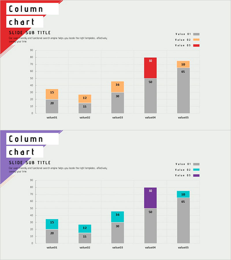
A PowerPoint slide presenting 5 items with 3 data series in a segmented stacked bar chart format. Three color schemes—gray, orange, and red—distinguish each series, with numeric labels clearly displayed for easy data interpretation during presentations. Two design versions are provided: one with red emphasis and another with purple emphasis, allowing you to match your presentation tone. Available in 16:9 widescreen PPTX format for immediate editing. Ideal for business reports, marketing analysis, strategy presentations, and comparative data visualization across various professional contexts.
Usage Points
-
Main Usage
Visualizes multi-series quantitative data across multiple items using a stacked bar chart format. Effectively compares sales figures, market share, performance metrics, and other numerical indicators to enhance audience comprehension. Color-coded series and direct numeric labeling ensure accurate information delivery.
-
How to Use
Apply in reports, analytical presentations, and strategy meetings to compare departmental, product, or time-period performance. Double-click chart data to edit values directly; the chart updates automatically. Select the color-emphasis version that highlights your key data series for maximum impact.
-
Recommended For
Finance, marketing, and sales professionals presenting quarterly or annual performance analysis. Suitable for consulting firms and research institutions reporting market survey results, manufacturing companies comparing production volumes, and retail businesses analyzing regional sales performance. Effective for executive briefings, investor presentations, and academic conferences.
-
Slide Structure
2-slide set. Top slide features red-emphasis version with 5 items (value01–value05) and 3 series (Value 01, 02, 03) in segmented bar format. Bottom slide presents the same data structure with purple emphasis. Numeric labels on each segment enable precise data reading and comparison.
Related Products
-

Mixed Bar Graph by Product – Visualization for Performance Maximization Strategy
#Business Strategy #Financial Plans and Performance #Graph
-

Coverage and Trends Graph – Market Trends and Competitive Analysis
#Market and Competitor Analysis #Graph #Industry Trends
-

Children’s Activity Preferences Comparison – Market Status and Competitive Advantage
#Market and Competitor Analysis #Graph #Market Status
-

100% Stack Horizontal Graph – Market Trend Analysis
#Market and Competitor Analysis #Graph #Market Analysis
