Blue Orange Male and Female Analysis Chart – Understanding Market and Customers
RJ0600062_12
- Last Update 07/06/2025
- File Size 3.4MB
- # of Slides 2
- File Format PPTX
- Slide Ratio 16:9
- Color
Keywords
About the Product
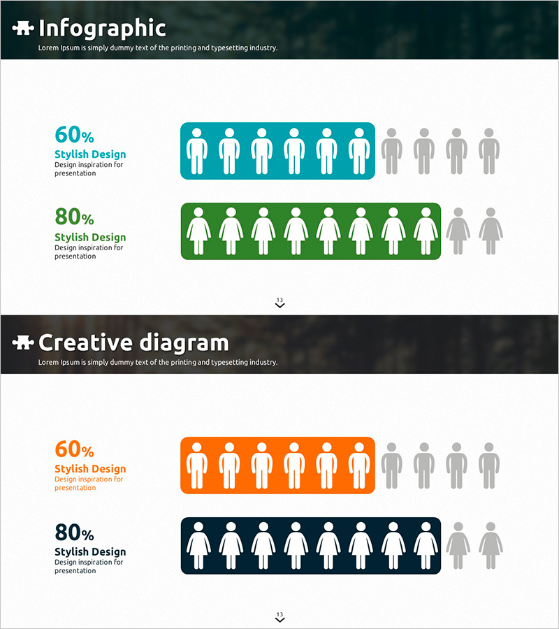
A PowerPoint slide designed for market and customer analysis using gender-based demographic data visualization. This infographic-style slide features blue and orange color-coded sections with percentage values and human icons to represent customer composition ratios intuitively. The 2-slide set allows side-by-side comparison of different datasets, optimized for 16:9 widescreen format in PPTX. Perfect for marketing presentations, business reports, investor pitches, and market analysis decks. All text, percentages, and labels are fully editable to accommodate your specific data.
Usage Points
-
Main Usage
Visualize customer segmentation and market composition ratios with clarity and impact. The combination of percentage data and human icons effectively communicates gender distribution, target market demographics, and user statistics in presentations.
-
How to Use
Insert into the target customer analysis section of marketing plans, customer overview pages in business reports, or market analysis segments of investor presentations. Simply edit the percentage values and labels within the blue and orange boxes to reflect your actual data.
-
Recommended For
Marketing managers, business planners, sales directors, and market analysts presenting customer demographics and gender distribution. Ideal for B2B proposals, new business plans, customer analysis reports, and data-driven decision-making presentations.
-
Slide Structure
Two-slide layout with each slide divided into left and right sections. Left side contains percentage values and label input areas; right side displays color-coded human icons showing proportional representation. First slide uses blue tones, second uses orange tones, enabling direct comparison of two datasets.
Related Products
-

Gender Analysis Graph – Stylish Slide for Customer Analysis
#Market and Competitor Analysis #Marketing Plan and Strategy #Graph
-

Collaboration Silhouette Diagram – Visual Tool for Customer Analysis
#Market and Competitor Analysis #Graph #Other
-

Customer Evaluation and Feedback on Renewable Energy Business - Doughnut Chart
#Market and Competitor Analysis #Customer Success Stories #Graph
-

Visualizing Vegetable Intake Survey Results for Males and Females
#Market and Competitor Analysis #Graph #Other
