Sewing Bell Graph Visualizing Recent Year Trends – Insights Included
RJ0600059_15
- Last Update 07/06/2025
- File Size 3.4MB
- # of Slides 2
- File Format PPTX
- Slide Ratio 16:9
- Color
Keywords
About the Product
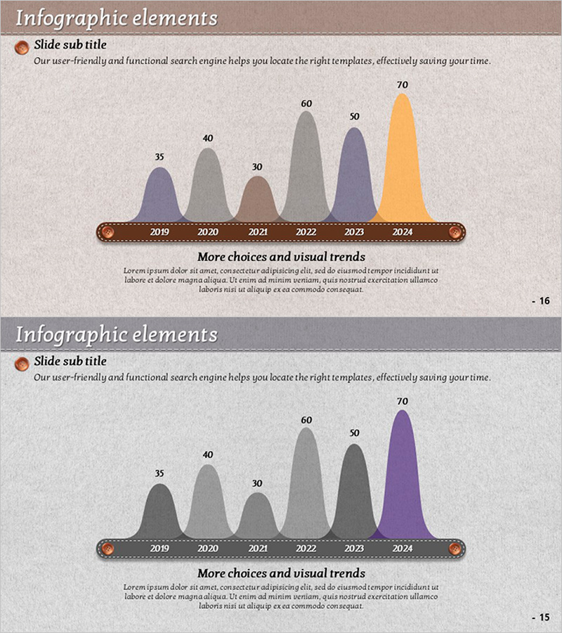
A two-slide PowerPoint presentation featuring bell curve area graphs that visualize six years of data trends from 2019 to 2024. The beige-toned background is complemented by gray, purple, and orange gradient-filled areas that clearly represent year-over-year values. Both slides display identical data structures with different color combinations, allowing you to select the most appropriate palette for your presentation context. This slide set is optimized for time-series data analysis including annual growth rates, sales trends, and market share evolution in business reports and performance presentations.
Usage Points
-
Main Usage
Communicate annual growth rates, sales trajectories, and market dynamics through visual representation that enhances audience comprehension. Bell curve distribution simultaneously conveys data central tendency and variability, making it ideal for statistical analysis, executive reports, and marketing performance presentations.
-
How to Use
The two slides present identical data structures in different color palettes. The first slide uses gray, purple, and orange combinations for a subdued tone, while the second emphasizes specific years through accent colors. Modify the numeric labels and year axis to match your dataset, then customize the title and subtitle sections to align with your presentation narrative.
-
Recommended For
Recommended for executives, data analysts, marketers, and finance professionals presenting quarterly performance reports, market research findings, financial statements, academic research, consulting proposals, and strategic business reviews where data-driven decision-making is paramount.
-
Slide Structure
Each slide displays six years of data (2019–2024) as bell-shaped area regions with numeric labels positioned above (35, 40, 30, 60, 50, 70). The year axis and decorative circular border elements anchor the bottom, while title and subtitle areas occupy the top section. Legend and explanatory text are positioned below the graph, creating clear information hierarchy.
Related Products
-

Ice Hockey Performance Graph – Competitiveness and Advantage
#Market and Competitor Analysis #Graph #Competitor Analysis
-

Analysis of Ship Order Volume – Effective Market Status Graph
#Market and Competitor Analysis #Financial Plans and Performance #Graph
-

User Analysis Graph by Age Group – Advanced Data Insights
#Market and Competitor Analysis #Diagram #Graph
-

Circular Gradient Wide Template Pie chart
#Company Introduction #Financial Plans and Performance #Graph
