Visualizing Sales Data with 100% Stacked Charts – Trust and Innovation
RJ0600056_22
- Last Update 07/05/2025
- File Size 2.2MB
- # of Slides 2
- File Format PPTX
- Slide Ratio 16:9
- Color
Keywords
About the Product
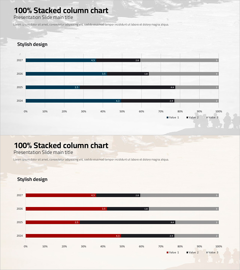
A PowerPoint slide featuring a 100% stacked column chart for visualizing sales data composition across four years (2024–2027) with three data series. The design uses a dark blue, black, and gray color palette that conveys professionalism and trust in business presentations. Each bar displays cumulative percentages from 0% to 100%, with numeric labels clearly visible for precise data interpretation. The layout is optimized for financial reports, performance reviews, and analytical presentations. Ready to download and edit with your own data in minutes.
Usage Points
-
Main Usage
Ideal for comparing the proportional composition of data across multiple time periods or categories on a 100% scale. Effectively visualizes how the relative share of each component changes over time, making it perfect for revenue breakdown, cost allocation, market share analysis, and budget distribution presentations.
-
How to Use
Insert this slide into financial reports, quarterly business reviews, investor presentations, or strategic planning decks. Simply replace the sample data with your actual figures, and adjust colors and labels as needed. The slide is fully editable in PowerPoint with no design restrictions.
-
Recommended For
Finance professionals, executives, marketing managers, management consultants, and data analysts presenting quarterly reports, board meetings, or client pitches. Especially useful when emphasizing how component proportions shift across multiple time periods or scenarios.
-
Slide Structure
Two-slide set, each featuring a 100% stacked horizontal bar chart with four year labels (2024–2027) and three data series. First slide uses dark blue, black, and gray; second slide offers a burgundy, black, and gray color variation. All bars include numeric labels for precise percentage reading.
Related Products
-

Analysis of the Gender Ratio of Users in the US Market – A Blend of Teal and Gray
#Market and Competitor Analysis #Graph #Other
-

Skill Graph for Performance Visualization – Vision and Growth
#Company Introduction #Product/Service Introduction #Graph
-

Global Comparison of National Sustainability Contributions
#Company Introduction #Market and Competitor Analysis #Graph
-

Sales Status by Donut Product Visualization – Attractive Graph Design
#Product/Service Introduction #Market and Competitor Analysis #Graph
