Palm Donut Chart – Market Share and Data Visualization
RJ0600028_5
- Last Update 06/28/2025
- File Size 4.3MB
- # of Slides 2
- File Format PPTX
- Slide Ratio 16:9
- Color
Keywords
About the Product
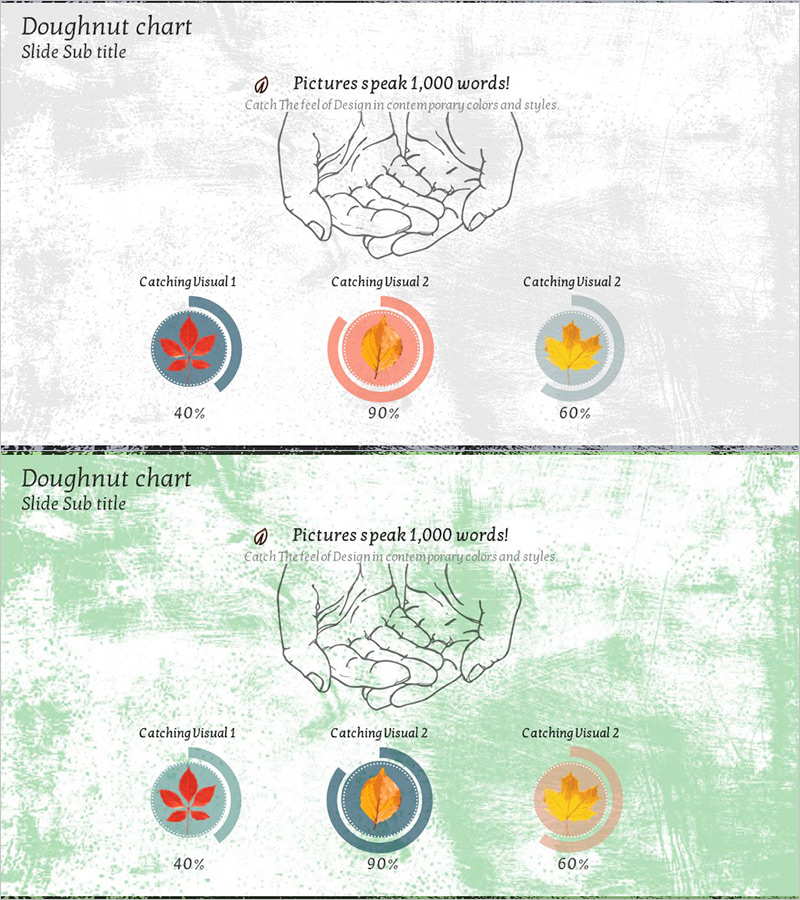
A PowerPoint slide featuring a hand illustration holding three donut charts displaying different data ratios (40%, 90%, 60%). Each donut chart is accompanied by leaf icons in red, orange, and yellow tones to enhance visual emphasis. The 2-slide set includes two design variations: one with a gray textured background and another with a green textured background, allowing you to match your presentation's overall tone. Ideal for instantly visualizing market share, sales distribution, customer satisfaction, and other ratio-based data in business presentations.
Usage Points
-
Main Usage
This slide effectively displays ratio and composition data using donut charts. Three donut charts are arranged on a single slide to compare multiple data segments simultaneously, while the hand illustration and leaf icons add visual interest. Perfect for presenting market share, sales distribution, customer satisfaction metrics, and product composition ratios.
-
How to Use
Use this slide in the market analysis, business status, or customer analysis sections of your presentation. Enter percentage values below each donut chart and add legend or descriptive text as needed. Choose between the gray or green textured background version to maintain consistency with your overall presentation design.
-
Recommended For
Recommended for marketing professionals, business analysts, strategists, and executives preparing marketing plans, business reports, investment pitch decks, product presentations, and management analysis documents. Especially effective when comparing multiple data segments simultaneously.
-
Slide Structure
The 2-slide set features a hand illustration with 'Pictures speak 1,000 words' text at the top center, and three donut charts (displaying 40%, 90%, and 60% respectively) arranged at the bottom. Each donut chart uses concentric circles to represent data, with percentage values displayed in the center. The first slide has a gray textured background, while the second features a green textured background.
Related Products
-

Red Sky Donut Chart – Market Share Analysis
#Company Introduction #Market and Competitor Analysis #Graph
-

Doughnut Chart for Office Worker Commuting Survey Results – Market Trends Visualization
#Market and Competitor Analysis #Graph #Market Status
-

Visualizing Market Share with Watercolor Donut Chart
#Market and Competitor Analysis #Graph #Market Share
-

Watercolor Customer Analysis Donut Chart – Visualizing Market Share
#Market and Competitor Analysis #Graph #Market Share
