Blue Orange Chart Analysis – Eye-Catching Data Visualization
RJ0600052_19
- Last Update 07/04/2025
- File Size 0.4MB
- # of Slides 2
- File Format PPTX
- Slide Ratio 16:9
- Color
Keywords
About the Product
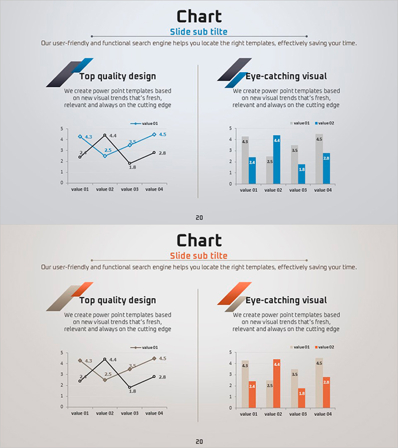
This free data analysis slide is available in two color schemes: blue and orange. It displays a line graph and a grouped column chart side by side, allowing you to visualize the same dataset in two different ways for comprehensive comparison. Simply replace the text and values in PowerPoint to instantly create professional presentation slides suitable for business plans, reports, marketing presentations, and any data-driven pitch deck. The slide is fully editable and ready to download for free.
Usage Points
-
Main Usage
Visualize the same dataset using both line graph and bar chart formats simultaneously to show trends and enable direct value comparisons in a single slide.
-
How to Use
Edit the title and section descriptions at the top, then input your chart data values. Choose between the blue or orange color version based on your presentation theme and audience.
-
Recommended For
Executive reports, investor presentations, financial performance analysis, market data comparisons, quarterly or annual trend analysis in business plans, reports, and marketing strategy decks.
-
Slide Structure
Single-slide layout with title and subtitle area at top, line graph on left side, grouped column chart on right side, and four text input areas for section titles and descriptions above each chart.
Related Products
-

Vertical Bar Chart for Data Analysis – Business Insights
#Free Graphs
-

Market Analysis Graph – Harmony of Pink and Bluegreen
#Free Graphs
-

Data Visualization with Bar Charts – Presentation for Efficient Choices
#Free Graphs
-

Bar Chart of Decline & Rise Analysis – Emphasizing Market Competitiveness
#Free Graphs
