Two Donut Circular Charts – Data Comparison Visualization
RJ0600045_14
- Last Update 07/02/2025
- File Size 0.4MB
- # of Slides 2
- File Format PPTX
- Slide Ratio 16:9
- Color
Keywords
About the Product
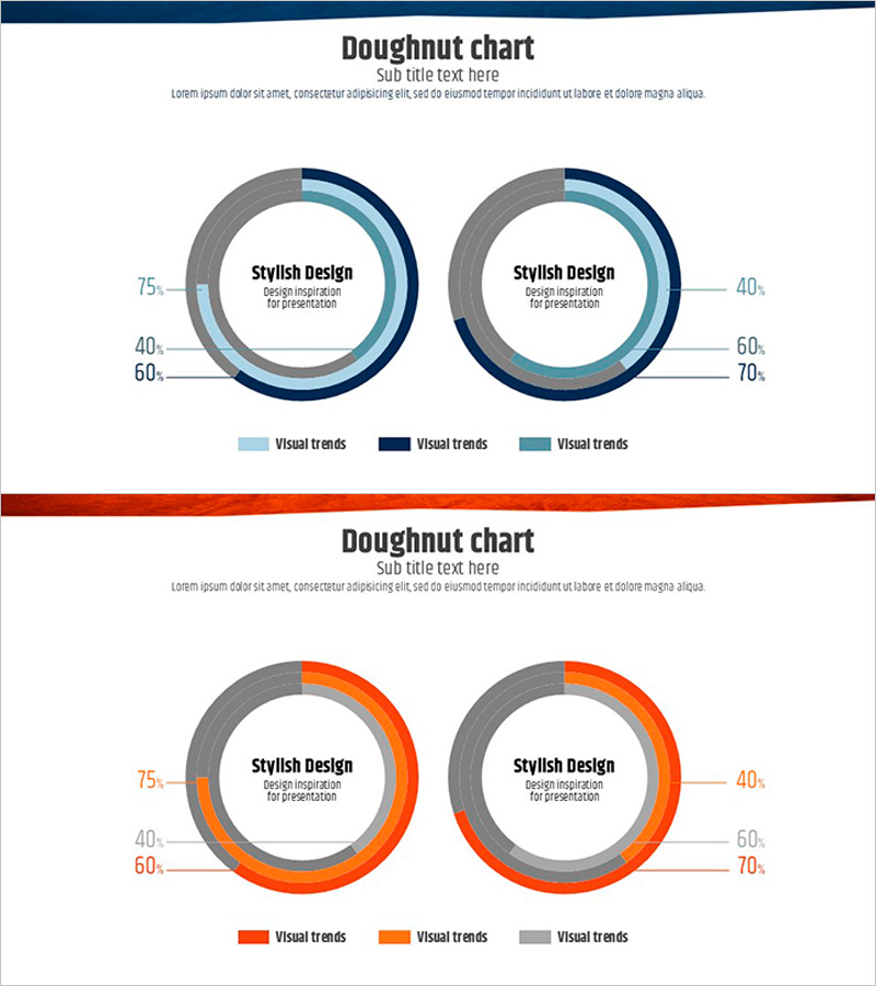
A 2-slide PowerPoint presentation featuring dual donut circular charts for data comparison and visualization. Each slide displays two donut charts with multi-layered rings capable of representing up to 3 data series simultaneously. The first slide uses a blue gradient color scheme (navy, light blue, and gray), while the second slide employs an orange gradient palette (red-orange, orange, and gray) for visual variety. Central text areas within each donut allow for key messages, percentages, or summary statistics. Designed in 16:9 widescreen format for modern projectors and digital displays. Fully editable PPTX format compatible with all PowerPoint versions, enabling quick customization of data values, labels, and color schemes.
Usage Points
-
Main Usage
Visualize quantitative data proportions, compositions, and distributions using donut circular charts to enhance audience comprehension. The side-by-side dual-chart layout enables intuitive comparison of different datasets, while center text areas emphasize key metrics or conclusions, strengthening presentation persuasiveness and data storytelling.
-
How to Use
Apply to business reports, market analysis presentations, financial reviews, and performance dashboards where market share, customer segmentation, revenue distribution, budget allocation, or survey results require visual representation. Edit chart values, labels, and color schemes to match your specific data. Combine both slides' color tones to create visual continuity across your presentation narrative.
-
Recommended For
Finance teams, marketing analysts, executives, management consultants, data scientists, and business intelligence professionals who regularly present quantitative insights. Ideal for quarterly earnings reports, customer demographic analysis, portfolio composition explanations, market research findings, competitive benchmarking, and ratio-based performance metrics.
-
Slide Structure
2-slide set. Each slide contains 2 donut charts arranged horizontally. Each donut comprises an outer multi-ring structure (supporting up to 3 data series) and a central text area for labels or key figures. Left chart displays data points at 75%, 40%, 60%; right chart at 40%, 60%, 70%. Legend positioned below charts with color-coded series labels for clarity.
Related Products
-

Line Graph Analysis Slide – Analyze the Market with Blue and Navy
#Market and Competitor Analysis #Graph #Competitor Analysis
-

Market Value Proof PowerPoint Slide – Line & Bar Chart Dark
#Business Strategy #Market and Competitor Analysis #Graph
-

Soccer Game Illustration Graph for Market and Competitive Analysis
#Business Strategy #Market and Competitor Analysis #Graph
-

Musicians and Gauge Charts Slide – The Uniqueness of Data Visualization
#Product/Service Introduction #Business Introduction #Graph
