Shadow Area Graph for Data Visualization – Sensational Representation
RJ0600043_32
- Last Update 07/02/2025
- File Size 0.2MB
- # of Slides 2
- File Format PPTX
- Slide Ratio 16:9
- Color
Keywords
About the Product
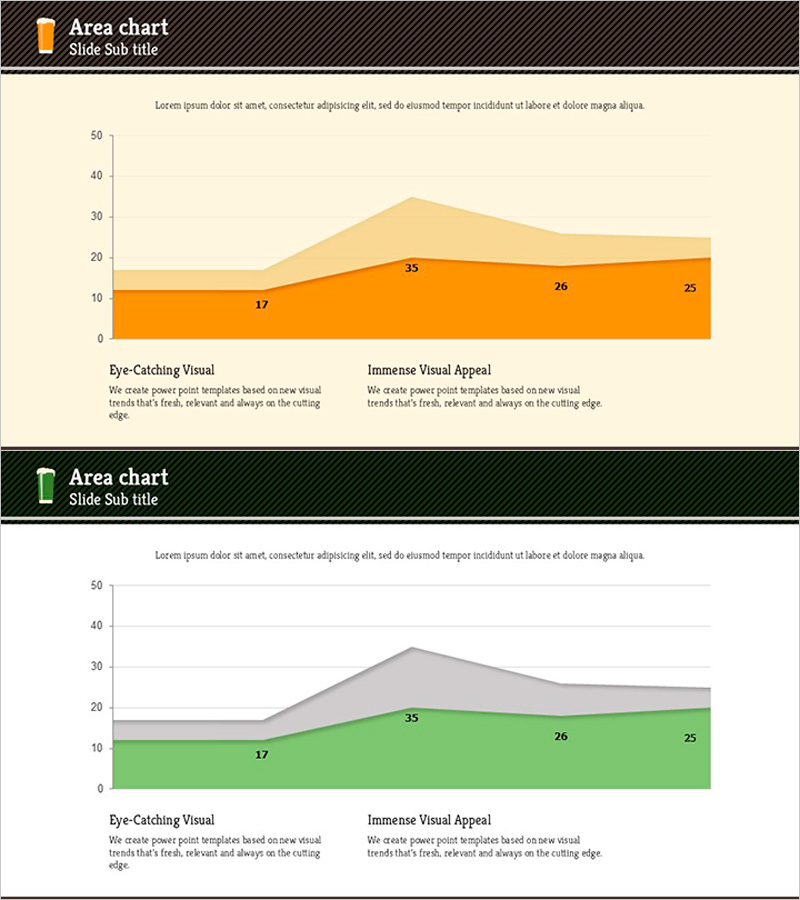
A PowerPoint slide featuring a stacked area chart that visualizes data changes across two series over time. The design combines orange and green color gradients to represent cumulative values and proportional relationships in an intuitive manner. Each slide includes clearly labeled data points that highlight key metrics during presentations. The unified design with beige background and black header bar ensures consistency across your presentation deck. This template is ready to use for business reports, marketing analysis, performance reviews, and financial presentations without additional formatting.
Usage Points
-
Main Usage
Displays cumulative changes and proportional relationships of multiple data series over time. The stacked area structure simultaneously conveys overall magnitude changes and individual series contributions, making it ideal for complex data analysis and comparative trend visualization.
-
How to Use
Use for marketing performance analysis, sales trend reporting, customer segment evolution, market share changes, and time-series data presentations. Simply update the slide title in the header, modify legend text, and input your data values to customize the chart immediately.
-
Recommended For
Executive reports, quarterly performance presentations, marketing campaign result analysis, financial status updates, and customer satisfaction trend reports. Highly suitable for management, planning, and marketing professionals who need data-driven decision-making visuals and academic presentations.
-
Slide Structure
2-slide set. Each slide contains a stacked area chart with orange (bottom series) and green (top series) representing two data dimensions. X-axis shows 3 time periods, Y-axis ranges from 0 to 50 with labeled intervals. Data points are explicitly marked with values (17, 35, 26, 25, etc.) for clear reference.
Related Products
-

User Analysis Graph by Age Group – Advanced Data Insights
#Market and Competitor Analysis #Diagram #Graph
-

Geometry Wide Line Graph – Perfect Choice for Market Analysis
#Market and Competitor Analysis #Graph #Market Status
-

Bar Graph Visualization of Pet Data
#Market and Competitor Analysis #Financial Plans and Performance #Graph
-

Recent Market Status Slide with Donut Chart
#Market and Competitor Analysis #Graph #Market Status
