Simple Comparable Bundle Chart – Clear Comparison Through Data Visualization
RJ0600042_15
- Last Update 07/02/2025
- File Size 0.4MB
- # of Slides 2
- File Format PPTX
- Slide Ratio 16:9
- Color
Keywords
About the Product
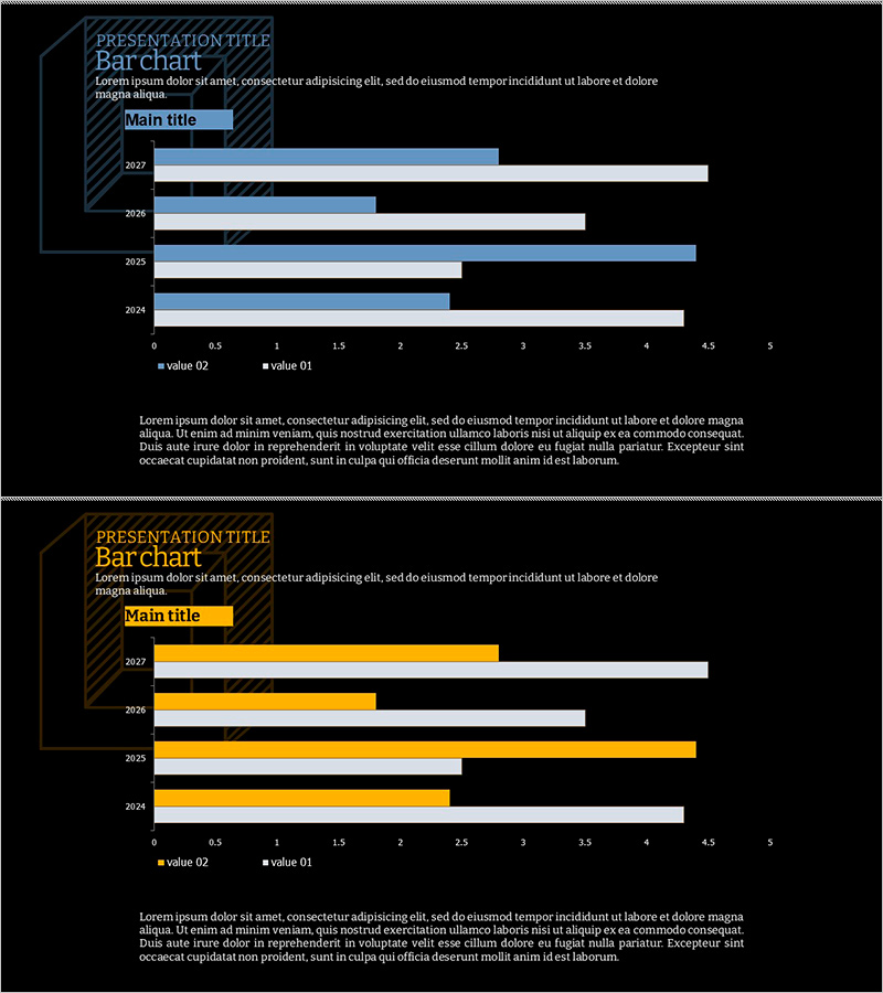
A grouped bar chart PowerPoint slide designed for comparing year-over-year data across two data series. Set against a dark background with light blue and white bars, this slide displays data from 2022 to 2025 with two values positioned side-by-side for intuitive numerical comparison. The horizontal layout features clear category labels and a legend, making it ideal for business presentations, quarterly performance reports, budget analysis, and financial comparisons. The 2-slide template accommodates multiple data scenarios and can be customized with your own figures.
Usage Points
-
Main Usage
Ideal for comparing two or more data series across categories such as years, quarters, or departments. The bar length visually represents numerical magnitude, while the legend and axis labels clearly communicate data meaning and enable quick pattern recognition.
-
How to Use
Use in quarterly revenue comparisons, year-over-year growth analysis, departmental target versus actual performance, and product-by-product sales comparisons. The dark background ensures readability in projector environments, and you can directly input your numerical data for immediate presentation use.
-
Recommended For
Finance teams presenting quarterly earnings reports, marketing teams analyzing channel performance, sales teams comparing regional results, and executive leadership reviewing operational dashboards. Suitable for any data-driven business presentation requiring multi-series numerical comparison.
-
Slide Structure
Comprises 2 slides, each displaying 4 years of data (2022–2025) across 2 data series (value 01 and value 02). Horizontal bar format with a 0–5 numerical axis range. Title and legend areas are clearly separated, allowing data entry without structural modification.
Related Products
-

3D Area Chart (Green & Blue) – New Possibilities in Data Visualization
#Graph
-

Eco-friendly Donut Graph Analysis – Insights on Market Trends
#Market and Competitor Analysis #Graph #Market Status
-

Speed Timer Diagram for Market Share Analysis
#Market and Competitor Analysis #Diagram #Graph
-

3 Radial Charts and Analysis – Competitor and Market Trends
#Market and Competitor Analysis #Diagram #Graph
