Farm Donut Chart Blue Green – Market Competitive Analysis
RJ0600019_6
- Last Update 06/26/2025
- File Size 0.3MB
- # of Slides 2
- File Format PPTX
- Slide Ratio 16:9
- Color
Keywords
- #Content-Based Slides
- #Design-Based Slides
- #Market and Competitor Analysis
- #Graph
- #Competitor Analysis
- #Competitive Advantage
- #Circles
- #Doughnut Chart
- #16:9
- #donut chart PowerPoint
- #donut graph slide template
- #ratio comparison slide
- #market analysis chart
- #competitive analysis PPT
- #pie chart PowerPoint slide
About the Product
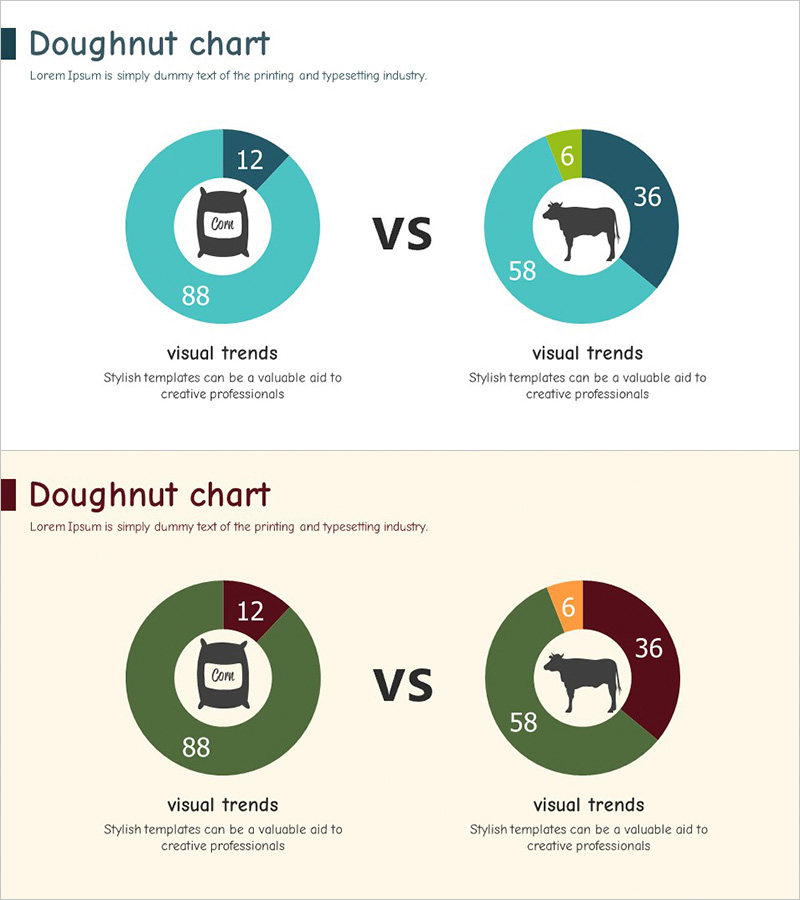
A donut chart PowerPoint slide optimized for market competitive analysis in the farm and livestock industry. Designed with a dual-tone blue and green color scheme, this slide enables intuitive comparison of two data categories. Central icons (coffee cup and cattle silhouette) clearly represent each category, while numerical values displayed on each segment show proportional relationships at a glance. Comprising 2 slides, this template is versatile for visualizing business data such as competitor analysis, market share, and sales volume comparisons. Available in 16:9 widescreen PPTX format for immediate editing and customization.
Usage Points
-
Main Usage
Designed to intuitively compare and visualize proportional relationships between two data categories. Ideal for farm management, livestock operations, and agricultural product distribution sectors to analyze market share, sales volume, and production quantity comparisons. Central icons clarify the subject matter and enhance audience comprehension.
-
How to Use
Use in executive reports, investor presentations, marketing strategy pitches, and business analysis documents to represent competitor comparisons or market segmentation data. Simply replace the numerical values in each segment with your own data and swap the central icons to match your industry or product category.
-
Recommended For
Farm and livestock company executives, agricultural product distribution managers, agricultural policy analysts, marketing planning teams, investment analysts, and business consultants who need to visualize market competitive analysis and ratio-based data.
-
Slide Structure
2-slide composition. Each slide features 2 donut charts arranged side-by-side in a 'vs' format to express comparative analysis. Each donut is divided into 3-4 segments with category icons (coffee cup and cattle) centered and numerical labels positioned on the outer edge. Background uses white or beige tones to emphasize chart visibility.
Related Products
-

Cartoon Theme Analysis Donut Circle Graph – Visualizing Market Competitiveness
#Market and Competitor Analysis #Graph #Competitor Analysis
-

Doughnut Chart Presentation for Pet Store Competitor Analysis
#Market and Competitor Analysis #Graph #Competitor Analysis
-

Medical Market Share Donut Pie Chart
#Market and Competitor Analysis #Graph #Competitor Analysis
-

Competitive Advantage Donut Pie Chart (3 colors) – Frontline of Market Analysis
#Market and Competitor Analysis #Graph #Competitor Analysis
