Carbon Neutral Vertical Bar Graph – Harmony of Brown and Blue
RJ0600018_6
- Last Update 06/25/2025
- File Size 0.6MB
- # of Slides 2
- File Format PPTX
- Slide Ratio 16:9
- Color
Keywords
- #Content-Based Slides
- #Design-Based Slides
- #Market and Competitor Analysis
- #Graph
- #Market Status
- #Column
- #Column Chart
- #16:9
- #vertical bar chart PowerPoint
- #5-item column chart slide
- #data comparison presentation template
- #market analysis graph
- #carbon neutral data visualization
- #bar chart PowerPoint slide download
About the Product
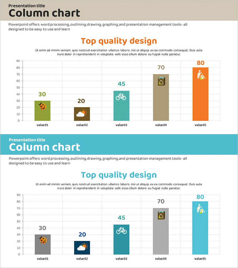
A vertical bar chart PowerPoint slide designed to compare five data values with a warm color palette of brown, teal, and orange. Perfect for market analysis, carbon neutrality reports, performance comparisons, and sustainability presentations. Each bar features a symbolic icon (bicycle, house, weather) to represent categories visually, with clear numerical labels displayed above. The 2-slide set offers two color variations so you can match your presentation theme. Fully editable PPTX format—simply input your data and the chart is ready to present.
Usage Points
-
Main Usage
This slide enables clear visual comparison of five numerical data points using vertical bars. Ideal for market trend analysis, carbon footprint reporting, departmental performance metrics, year-over-year comparisons, and sustainability statistics. Numerical labels above each bar ensure precise value communication to your audience.
-
How to Use
Insert this slide into your report, proposal, or investor presentation's data analysis section. Open the slide, replace item names and values with your own data, and the bar heights adjust automatically. Two color schemes are provided—select the version that best matches your presentation's overall design and topic tone.
-
Recommended For
Marketing professionals, financial analysts, management consultants, sustainability officers, and sales teams presenting performance reports and market insights. Particularly effective for environmental, carbon neutrality, energy efficiency, and green product presentations where data credibility is essential.
-
Slide Structure
2-slide set, each containing 5 vertical bars. Slide 1 features a brown, teal & orange color mix; Slide 2 uses gray, teal & orange. Each bar displays a numerical label (30, 20, 45, 70, 80) at the top, with category names (value01–value05) at the bottom. Symbolic icons represent each category, enhancing visual recognition and data context.
Related Products
-

Outlook Analysis Graph for Market and Competitive Analysis
#Market and Competitor Analysis #Graph #Market Status
-

Real Estate Sales and Consumer Analysis Slide
#Market and Competitor Analysis #Graph #Market Status
-

Battery Shape Vertical Bar Graph – Competitor Analysis
#Technical Approach #Market and Competitor Analysis #Graph
-

Bar Chart Visualizing Yacht Tour Satisfaction
#Market and Competitor Analysis #Graph #Other
