Carbon Neutral Market Analysis Chart – Brown Blue Design
RJ0600018_26
- Last Update 06/25/2025
- File Size 0.5MB
- # of Slides 2
- File Format PPTX
- Slide Ratio 16:9
- Color
Keywords
About the Product
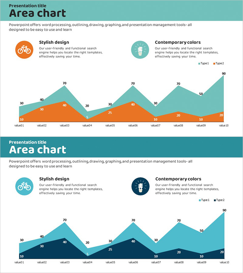
An area chart PowerPoint slide designed for market trend analysis and data comparison. This presentation template features a dual-layer visualization using teal and orange color schemes to display two data series over time. Each data point is labeled with precise numerical values, enabling clear comparison of trends and correlations. The upper section includes icon placeholders and text boxes for presenting analysis themes and key insights. The 16:9 widescreen PPTX format is fully editable and ready for immediate use in business presentations, market research reports, ESG initiatives, and strategic planning documents.
Usage Points
-
Main Usage
This slide effectively compares two key metrics over time, such as market size, market share, or growth rates. The overlapping area visualization makes data relationships and trends immediately apparent, making it ideal for investor presentations, executive briefings, and partner communications where market insights must be clearly demonstrated.
-
How to Use
Replace the icon section with your analysis topic (carbon neutrality, renewable energy, market share, etc.) and update the chart data with actual figures. Modify the legend labels (Type1 and Type2) to reflect your specific data categories, then add key insights in the text description boxes. Colors can be adjusted to match your corporate branding guidelines.
-
Recommended For
Recommended for market analysis sections in business plans, competitive analysis reports, investment pitch decks, marketing strategy presentations, and ESG/sustainability reports. Particularly effective when emphasizing market evolution and temporal trends in emerging sectors or strategic initiatives.
-
Slide Structure
The slide layout consists of an upper section with two icon placeholders and two text description boxes, paired with a lower area chart visualization. The chart displays 10 data points across two layers with clearly labeled numeric values. Legend and axis labels are prominently positioned for easy data interpretation and audience comprehension.
Related Products
-

Area Chart for Market Trend Analysis – Insights and Growth
#Market and Competitor Analysis #Financial Plans and Performance #Graph
-

Future Outlook Line Graph Blue Orange
#Market and Competitor Analysis #Graph #Other
-

Stacked Bar Chart by Country – Visualizing Market Trends
#Market and Competitor Analysis #Graph #Other
-

Core Technologies of AI Chipsets: Performance Characteristics
#Market and Competitor Analysis #Diagram #Graph
