Carbon Neutral Business Competitor Analysis – Insights into the Market
RJ0600018_23
- Last Update 06/25/2025
- File Size 0.6MB
- # of Slides 2
- File Format PPTX
- Slide Ratio 16:9
- Color
Keywords
- #Content-Based Slides
- #Design-Based Slides
- #Market and Competitor Analysis
- #Graph
- #Market Analysis
- #Horizontal Bar
- #Horizontal Bar Chart
- #16:9
- #radial diagram PowerPoint
- #world map slide template
- #global network diagram
- #icon-based infographic PPT
- #horizontal bar chart slide
- #international business presentation
About the Product
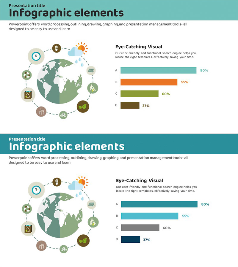
A PowerPoint slide featuring a world map at the center with eight industry icons arranged in a radial pattern and connected by dotted lines. The icons represent diverse sectors including time, energy, global commerce, construction, finance, environment, renewable energy, and agriculture, visualizing global business networks and international collaboration. On the right side, a horizontal bar chart with four data series displays comparative metrics. The teal header and neutral background make this presentation slide ideal for corporate reports, market analysis, and international business strategy presentations.
Usage Points
-
Main Usage
Visualizes global business networks, international partnerships, and industry-specific market analysis. The world map serves as the central hub with industry icons radiating outward, while the horizontal bar chart on the right enables comparative data analysis across sectors.
-
How to Use
Use in executive briefings, international business strategy presentations, and industry market analysis reports. Replace the icons around the world map to represent specific industries or business domains, and update the chart data with actual figures for immediate deployment in your presentation.
-
Recommended For
Executives, marketing professionals, business analysts, international business managers, consultants, and policy makers presenting global market conditions, competitive analysis, and industry trends. Applicable to carbon neutrality, ESG, energy, agriculture, construction, and other diverse industry sectors.
-
Slide Structure
Left side features a world map with eight industry icons (clock, sun, globe, construction, finance, environment, energy, agriculture) connected by dotted lines in radial pattern. Right side displays a horizontal bar chart with four categories (A, B, C, D) showing percentage data (80%, 55%, 60%, 37%). 16:9 aspect ratio, 2-slide set.
Related Products
-

Bar Chart for Vegetable Intake Survey
#Market and Competitor Analysis #Graph #Market Analysis
-

Scientific Research Results Graph – A Tool for Market Analysis and Competitive Advantage
#Market and Competitor Analysis #Graph #Market Analysis
-

Pencil Bar Chart for Market Analysis – Visual Competitiveness
#Market and Competitor Analysis #Graph #Other
-

Key Performance Bar & Line Analysis Chart – Integrated Market Performance Visualization
#Company Introduction #Market and Competitor Analysis #Graph
