Healthcare Management Diagram – Data Visualization and Efficiency
RJ0600017_28
- Last Update 06/25/2025
- File Size 0.2MB
- # of Slides 2
- File Format PPTX
- Slide Ratio 16:9
- Color
Keywords
- #Content-Based Slides
- #Design-Based Slides
- #Technical Approach
- #Diagram
- #Service Components
- #Service Implementation Plan
- #Spread
- #Decentralized Diagram
- #16:9
- #Venn diagram PowerPoint
- #3-node diagram slide
- #healthcare management presentation
- #data visualization diagram
- #relationship chart PPT template
About the Product
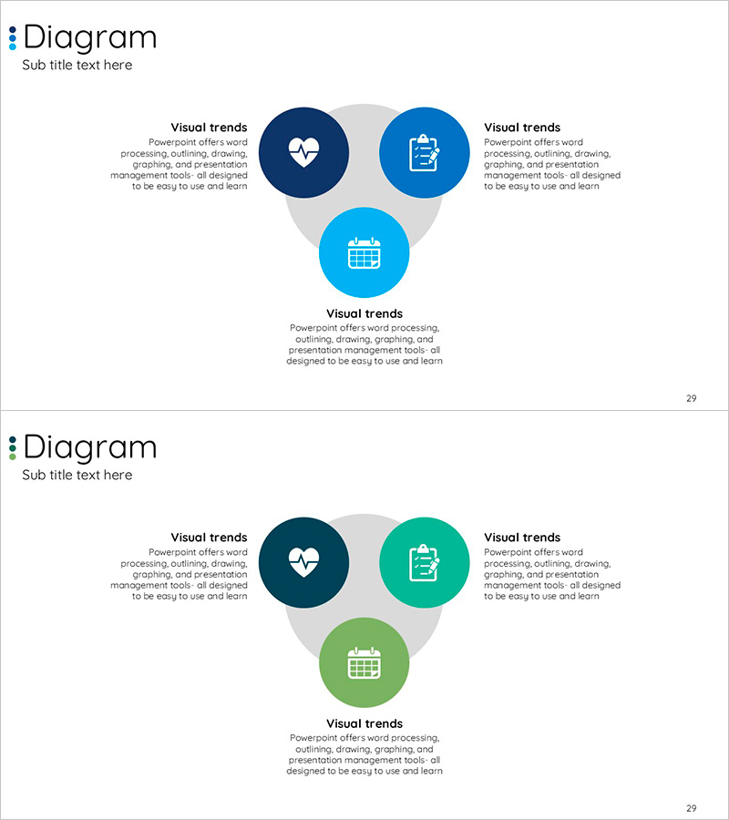
A 3-node Venn diagram PowerPoint slide designed to visualize healthcare management and service structure. Three circular nodes overlap in a central gray area, each accommodating icons and descriptive text. The color palette combines dark blue, bright blue, and teal tones to convey trust and professionalism in the medical field. The 2-slide set includes color variations (dark blue, teal, and green versions) for flexible presentation contexts. Ideal for communicating complex relationships, process connections, and organizational structures in business presentations, medical seminars, and project proposals.
Usage Points
-
Main Usage
Visualizes healthcare management, medical service composition, inter-organizational relationships, and data connection structures across three distinct areas. Each node accommodates icons and descriptive text, enabling intuitive communication of complex information.
-
How to Use
Use in corporate presentations, healthcare facility briefings, project proposals, and educational seminars to explain service composition, process connections, and organizational structures. Edit node text and icons to adapt the diagram to various topics and contexts.
-
Recommended For
Healthcare professionals, hospital administrators, service planners, project managers, consultants, and educators explaining organizational structures, service relationships, and data connections to stakeholders.
-
Slide Structure
2-slide set. Each slide features three circular nodes overlapping in a central gray area. Top, left, and right nodes each contain icons (heart, clipboard, calendar) and text input fields, with additional descriptive text space below. Color variations: dark blue, teal, and green palettes.
Related Products
-

Business Circular Diagram – Expressing Service Execution Plans
#Technical Approach #Diagram #Service Components
-

Cube Structure Diagram – Effective Product and Service Explanation
#Product/Service Introduction #Technical Approach #Diagram
-

Summary of Key Strategic Measures – Non-Centralized Diagram
#Business Vision and Strategy #Technical Approach #Diagram
-

Stripe Template Tree Structure – Capturing the Framework of Service Composition
#Technical Approach #Diagram #Service Components
