Area Chart Partial Comment – Stylish Data Analysis
RJ0600012_17
- Last Update 06/24/2025
- File Size 0.2MB
- # of Slides 2
- File Format PPTX
- Slide Ratio 16:9
- Color
Keywords
About the Product
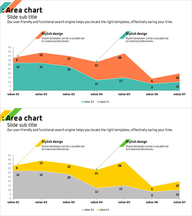
A PowerPoint slide featuring a two-series area chart that visualizes data changes across seven time points in orange and teal colors. Each data point displays numerical labels for precise value comparison, while partial comment boxes highlight key insights. The stacked area design clearly shows both the individual trends and cumulative impact of each data series. Ideal for marketing performance reports, sales analysis, customer satisfaction trends, and any business presentation requiring time-series data visualization.
Usage Points
-
Main Usage
Visualizes the progression of two or more data series over time, allowing viewers to compare relative magnitudes and trends simultaneously. The stacked area format emphasizes cumulative growth while the color differentiation makes individual series easy to distinguish.
-
How to Use
Apply to marketing performance reports, sales trend analysis, customer satisfaction tracking, market share evolution, revenue versus cost comparisons, and quarterly business reviews. Edit the data labels, colors, and comment text to match your specific metrics and presentation context.
-
Recommended For
Financial analysts, marketing managers, sales directors, business intelligence professionals, management consultants, data scientists, and executives presenting quantitative performance metrics to stakeholders.
-
Slide Structure
Two-series stacked area chart (orange and teal), seven X-axis time points (value 01–07), numerical data labels at each point, legend (value 01, value 02), title area top-left, two partial comment boxes top-right. 16:9 widescreen format, 2-slide set.
Related Products
-

Competitor Comparison Analysis Broken Line Overlay Graph
#Market and Competitor Analysis #Graph #Competitor Analysis
-

Business Service Composition Diagram – Intuitive Visualization and Strategic Guidance
#Business Vision and Strategy #Technical Approach #Diagram
-

Graph Analyzing Lung Cancer Treatment Trends – Market Potential and Future Outlook
#Business Strategy #Market and Competitor Analysis #Graph
-

Identity Wide Template – Double Horizontal Bar Graph Usage
#Market and Competitor Analysis #Graph #Competitive Advantage
