Monthly Segmented Chart Analysis – Insightful Data Visualization
RJ0600011_15
- Last Update 06/23/2025
- File Size 1.1MB
- # of Slides 2
- File Format PPTX
- Slide Ratio 16:9
- Color
Keywords
About the Product
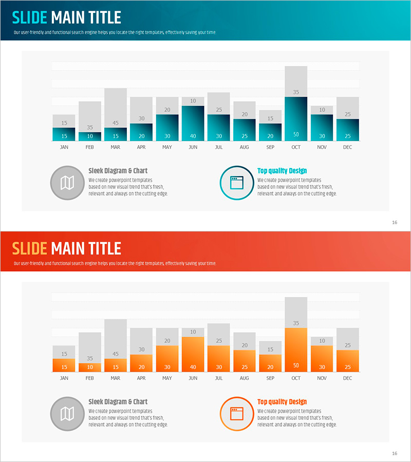
A PowerPoint slide that visualizes monthly data using dual-series stacked bar charts. Each of the 12 months (January through December) displays two data series side by side, enabling simultaneous comparison of monthly trends and inter-series relationships. The design combines a gray cumulative area at the top with colored bars (teal and orange) below, creating visual depth and clarity. Ready to insert into presentations, reports, and analytical documents; all colors and values are fully editable for your specific data.
Usage Points
-
Main Usage
Compare two key metrics (sales, traffic, revenue) across 12 months in a single visualization. Instantly reveal monthly fluctuations, seasonal patterns, and correlations between data series for data-driven decision making.
-
How to Use
Insert into quarterly business reviews, monthly performance reports, or analytical presentations. The stacked structure effectively shows both aggregate totals and individual series breakdown, making it ideal for layered data narratives.
-
Recommended For
Sales and marketing teams presenting monthly KPI comparisons, finance professionals reporting quarterly results, management consultants analyzing time-series data, researchers visualizing statistical trends across 12-month periods.
-
Slide Structure
2-slide set. Slide 1 features teal dual-series stacked bar chart (12 months with gray cumulative area + teal bars); Slide 2 uses orange color scheme with identical structure. Each slide includes 2 text callout boxes with icons for annotations.
Related Products
-

Architectural Illustration Templates and Line Charts – Visualizing Market and Competitive Advantage
#Market and Competitor Analysis #Graph #Market Analysis
-

Competitor Analysis and Competitive Advantage Visualization – Harmony of Green and Orange
#Market and Competitor Analysis #Diagram #Graph
-

Analyzing Bank Delinquency Rate Trends with Stacked Area Chart
#Business Strategy #Market and Competitor Analysis #Graph
-

Doughnut Chart Slide for Analyzing Technology Data
#Business Introduction #Business Strategy #Graph
