Five-Colored Horizontal Bar Chart – Visual Data Emphasis
RJ0600008_6
- Last Update 06/23/2025
- File Size 0.1MB
- # of Slides 2
- File Format PPTX
- Slide Ratio 16:9
- Color
Keywords
About the Product
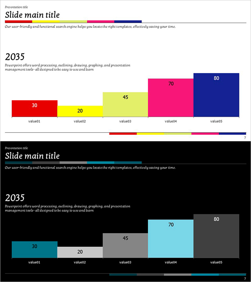
A horizontal bar chart PowerPoint slide designed to compare five data items with distinct visual impact. Each item is represented by a separate color—red, yellow, lime green, magenta, and navy blue—making it easy to differentiate and analyze comparative data. The 2-slide template includes a standard white background version and a dark background variant for flexible presentation contexts. Formatted in 16:9 widescreen PPTX, the bars and numerical labels are fully editable, allowing you to input your own data and instantly update the visualization. Ideal for business reports, performance metrics, and data-driven presentations.
Usage Points
-
Main Usage
Display comparative metrics such as sales performance, departmental results, product revenue, customer satisfaction scores, or market share across five categories. The horizontal bar format makes it simple to rank and compare values at a glance.
-
How to Use
Slide 1 presents the full dataset with all five bars. Slide 2 offers a dark background version with the same structure for alternative presentation contexts. Double-click the bar values and labels to replace them with your own data; the chart updates automatically.
-
Recommended For
Executive summaries, quarterly performance reviews, marketing analysis reports, financial statements, and competitive benchmarking presentations. Suitable for sales teams, finance departments, marketing teams, and strategic planning sessions.
-
Slide Structure
2 slides total. Slide 1: Five horizontal bars (value01–value05, ranging 30–80) on white background with color-coded legend bar at bottom. Slide 2: Identical structure with dark background and cyan/gray bar tones. Both slides feature 16:9 widescreen format with editable text and numerical labels.
Related Products
-

Visualizing Experimental Results with Bar Chart Slide
#Product/Service Introduction #Market and Competitor Analysis #Graph
-

Electric Vehicle Fire Accident Graph - Market Status and Risk Management
#Market and Competitor Analysis #Risk Management and Regulatory Compliance #Graph
-

Future Outlook Analysis Graph – Market and Competitive Analysis
#Market and Competitor Analysis #Graph #Other
-

Camera Function Horizontal Bar Chart – Emphasizing Product Features Visually
#Product/Service Introduction #Graph #Other
